Mythology
Branding / Art Direction
Role
Art Director & Designer
Contributions
Brand Identity, Packaging Design, Illustration, Typography
Client
Natalya Balnova
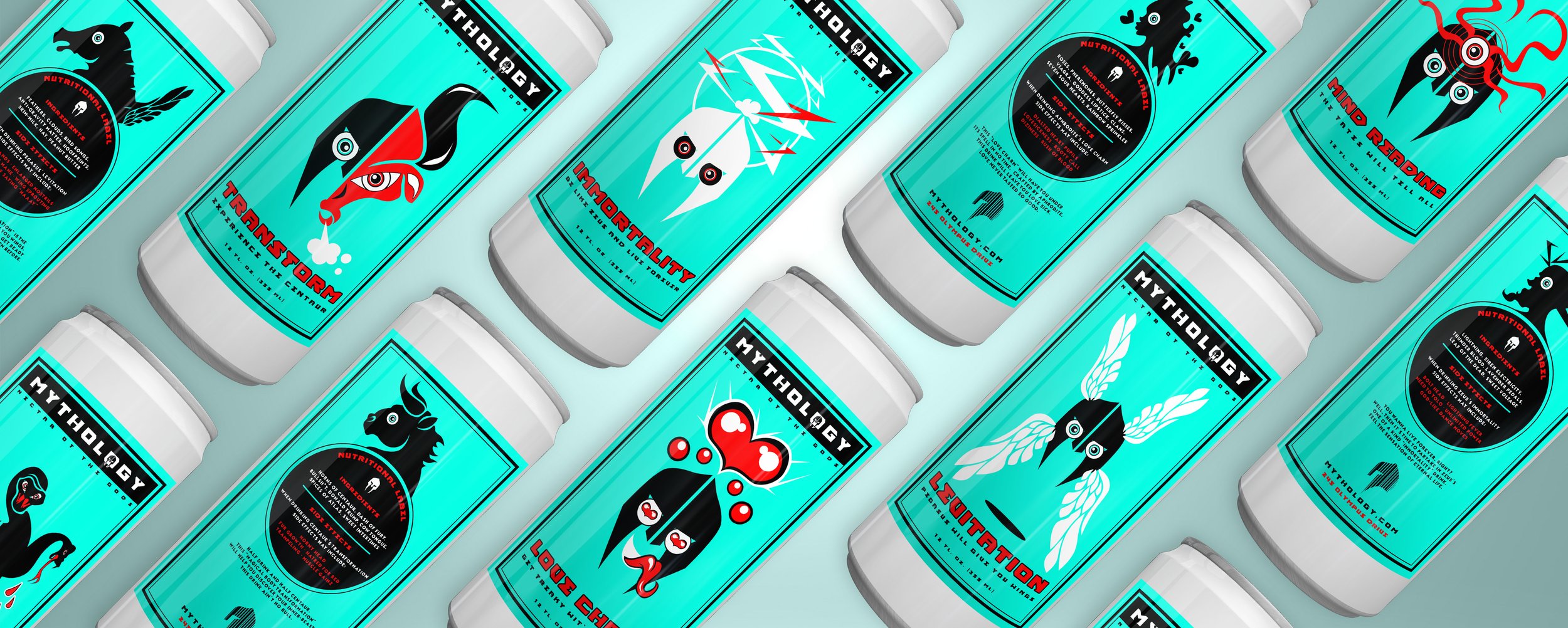
Mythology is a packaging concept for a six-pack of “Magic Drinks,” with each flavor inspired by a different figure from Greek mythology. I developed the identity, illustrations, and packaging system to give each character a distinct personality while keeping the collection visually cohesive.

Logo Mark
The Mythology logo draws inspiration from the famous Greek army: The Spartans! However, with his big blue eyes, who could be afraid of this cool little guy, right? Our logo type utilizes our main brand type 'Ancient God,' while our icon distills our Spartan logo into a simple and sweet mark.


Drink Packaging
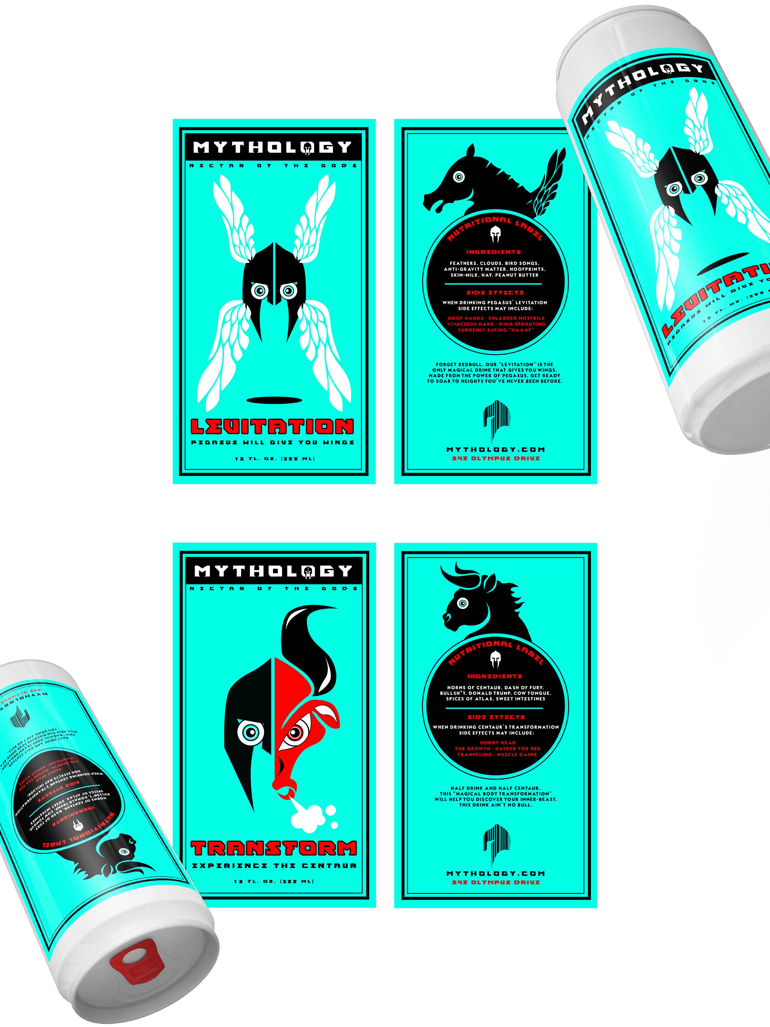
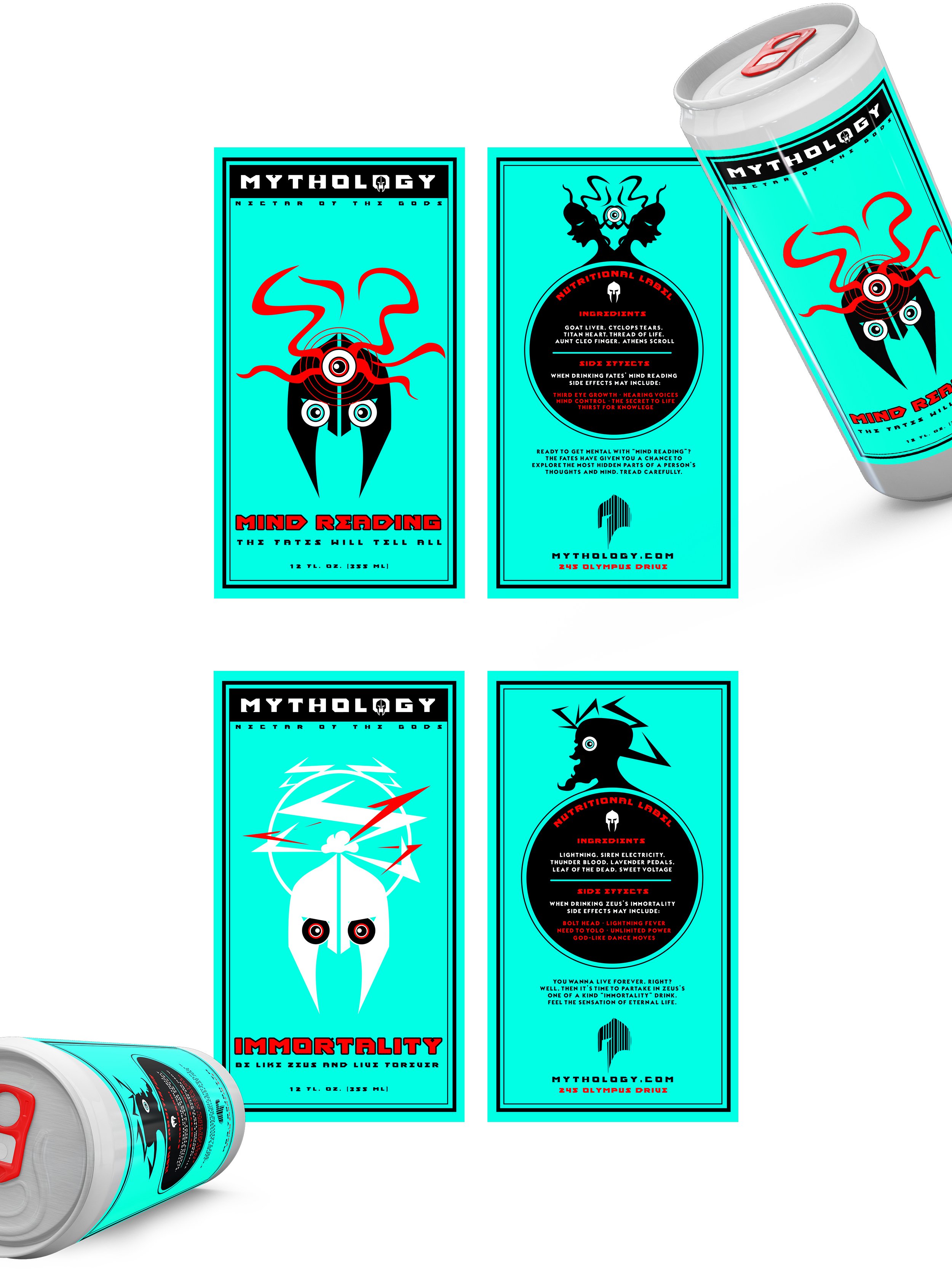
The MythBusters got nothing on us! Take a look at our six specialty flavors, inspired by Greek characters such as Aphrodite, Medusa, Pegasus, Centaurs, The Fates, and Zeus. Be sure to read up on our delicious ingredients and ravaging side effects.

Color Palette & Typeface
At Mythology, we believe simplicity is the tastiest truth. Our brand utilizes three main colors: Antiquity Blue, Myth Black, and Spartan Red. As for typefaces, 'Ancient God' is used as our main brand typeface, and 'Typographica' is implemented for utilitarian copy.


More Selected Projects

Survival Kit - Branding Design

Sony Music

Poster Design

Hijinks Circus - Branding Design
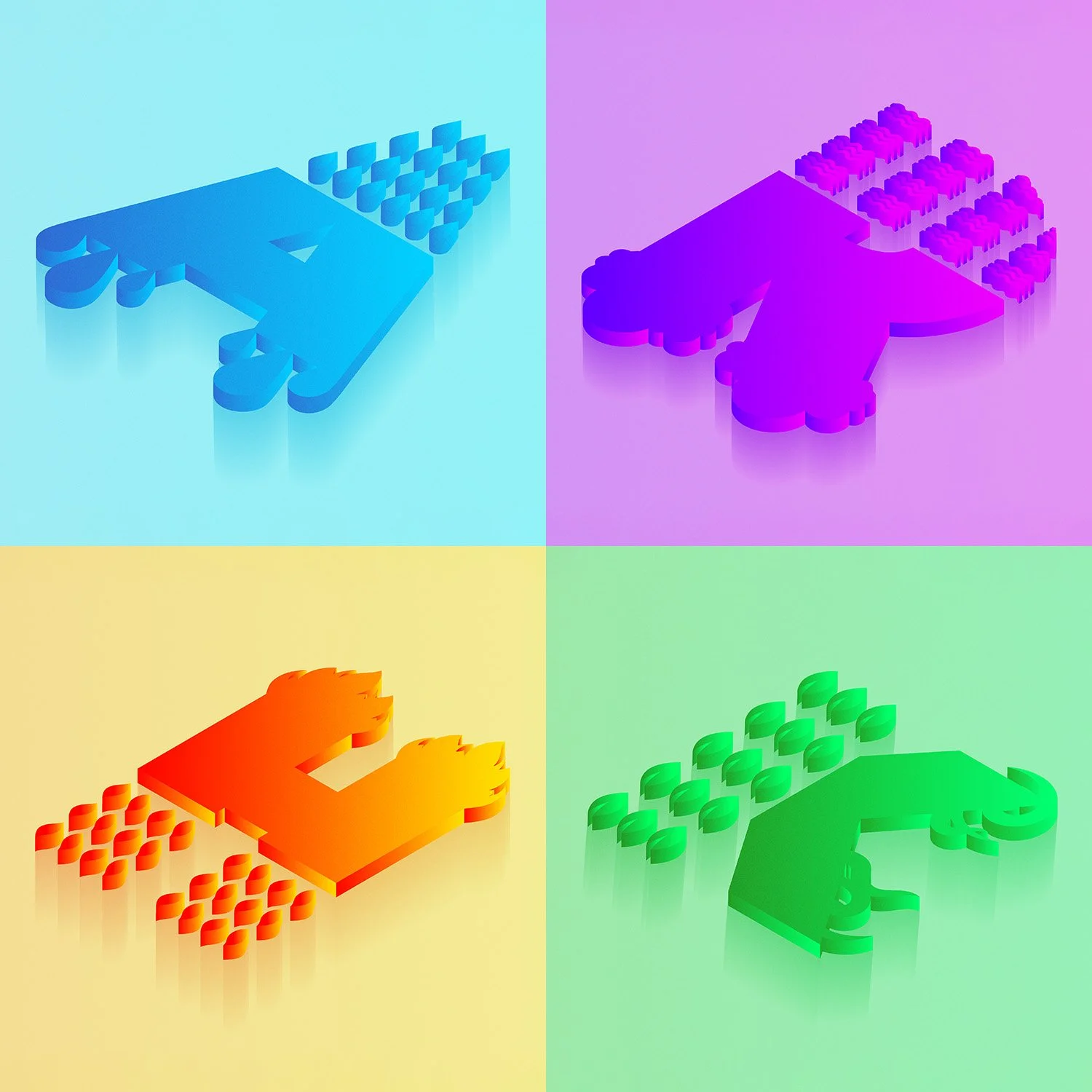
Alchemy Alphabet - Drop Cap Design

Print Design

Telescoop - Branding Design