
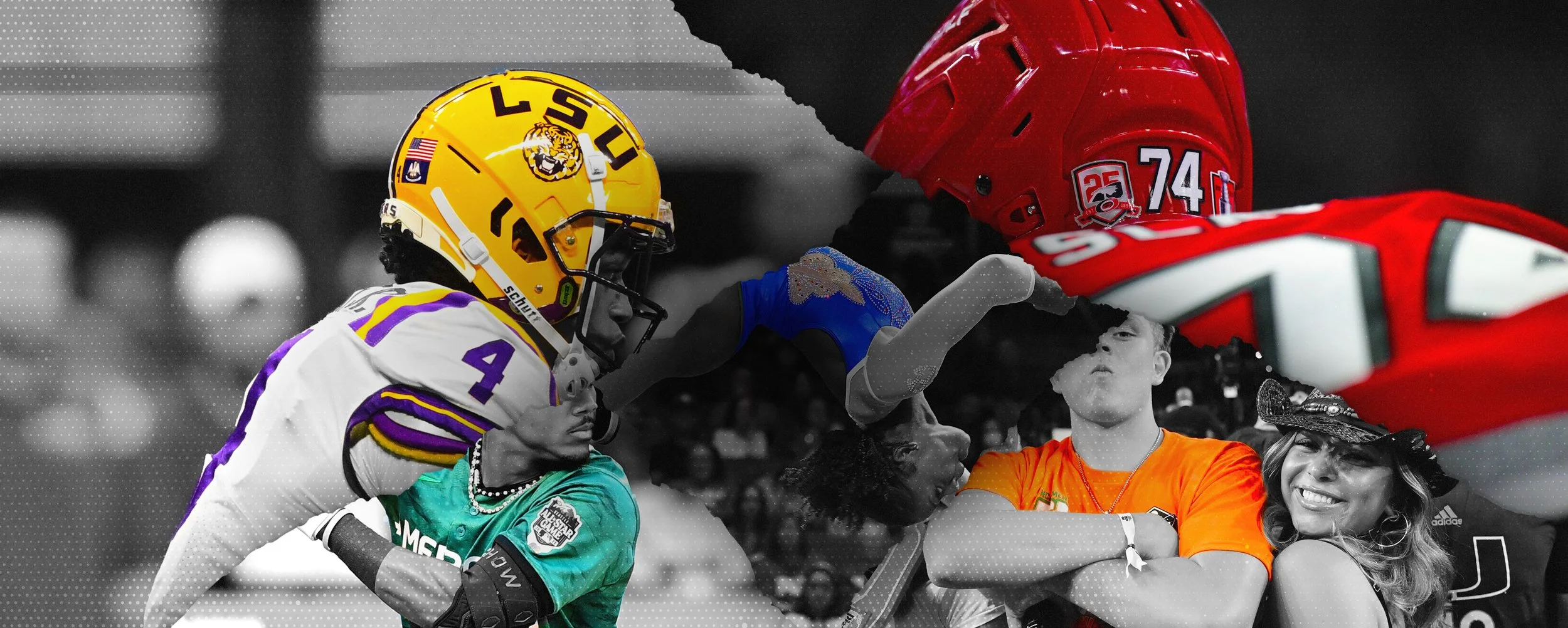

Tournament Challenge - Brand Redesign
Brand Identity · Visual System · Digital Experience
Role
Visual Design / Brand Design
Contributions
Color System, Pattern Design, Iconography, Brand Guidelines
Creative Director
Angelica Mckinley
Collaborating Designers
Chandler Brunelli, Rolonda Allison, Harry Choi & Doug Herman
For ESPN Tournament Challenge, I developed key elements of the visual identity, including the brand color system and logo color treatment. I also created handmade icons, textures, and patterns, and helped establish the brand guidelines that brought these elements together into a cohesive, scalable visual system.
The Challenge
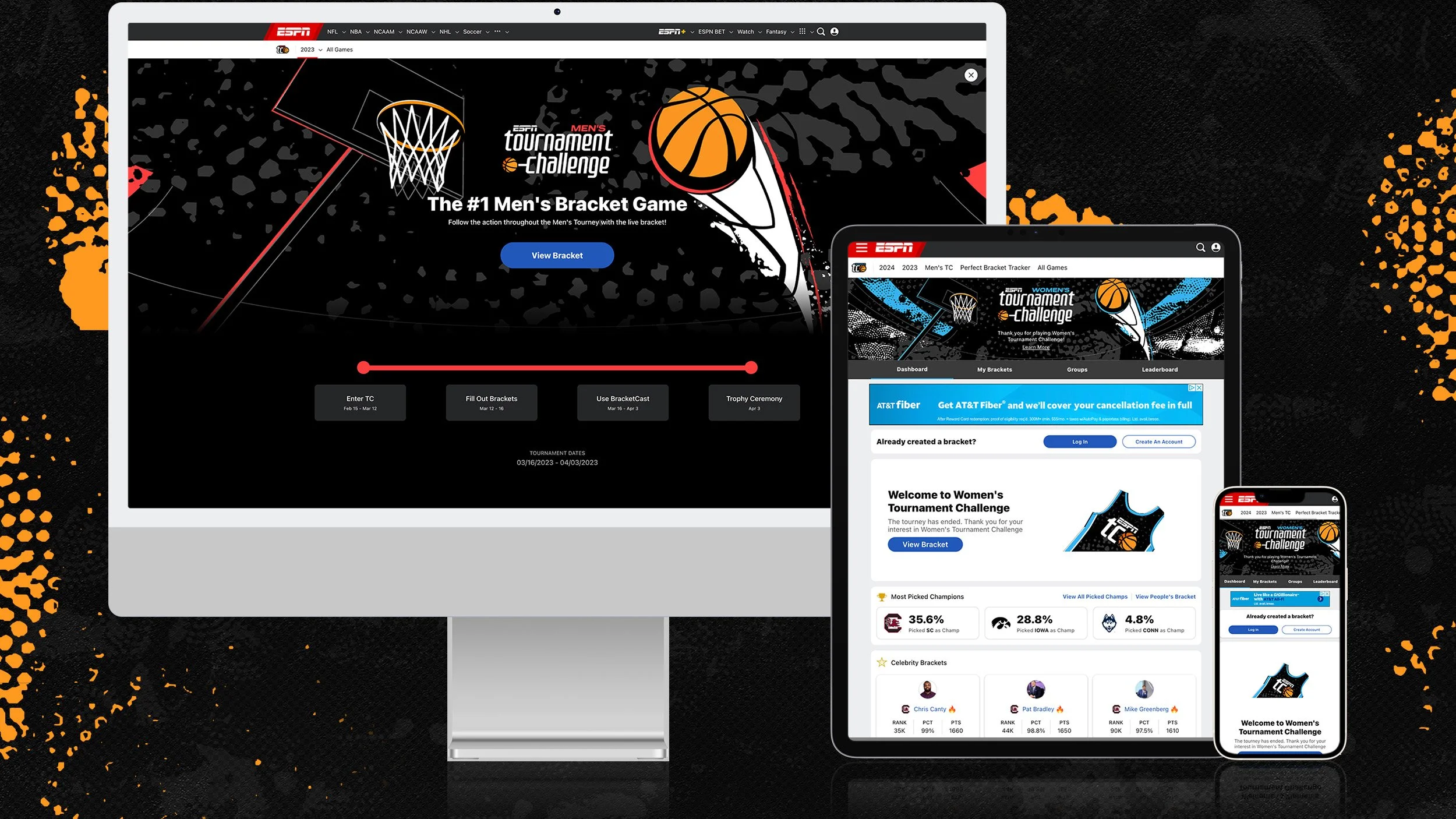
ESPN Tournament Challenge needed a unified visual identity that could bring the Men’s and Women’s experiences together while giving each tournament equal presence. The challenge was to create a distinctive, flexible system that felt unmistakably ESPN and could scale across the product, marketing, and campaign touchpoints.
01 — Create Parity
Bring the Men’s and Women’s experiences under one unified identity with equal visual presence.
02 — Build Recognition
Establish a distinctive Tournament Challenge identity that still feels unmistakably ESPN.
03 — Design for Scale
Create a flexible system that could extend across product, marketing, social, and campaign touchpoints.


Logo & Color Exploration
Creating greater parity between the Men’s and Women’s Tournament Challenge experiences was a key goal of the redesign. We explored how color could give each tournament a distinct identity while maintaining equal presence within a unified ESPN system.
01 — Authentic
Grounded in ESPN’s established visual language and the energy of college basketball.
02 — Bold
Higher-impact typography, color, and graphic treatments designed to stand out across digital experiences.
03 — Fun
A more expressive, energetic direction using unexpected color combinations and playful visual elements.





Logo Redesign
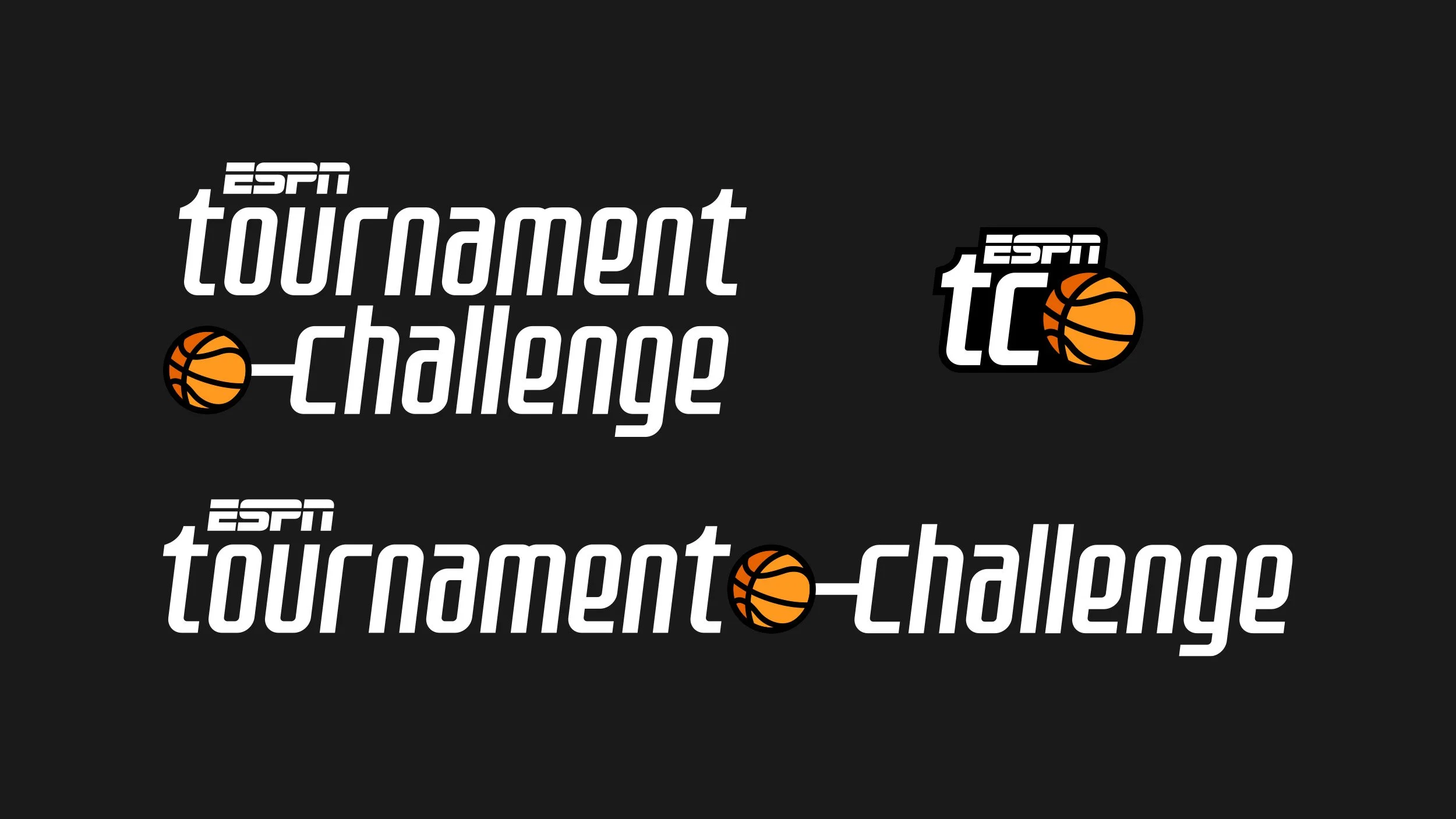
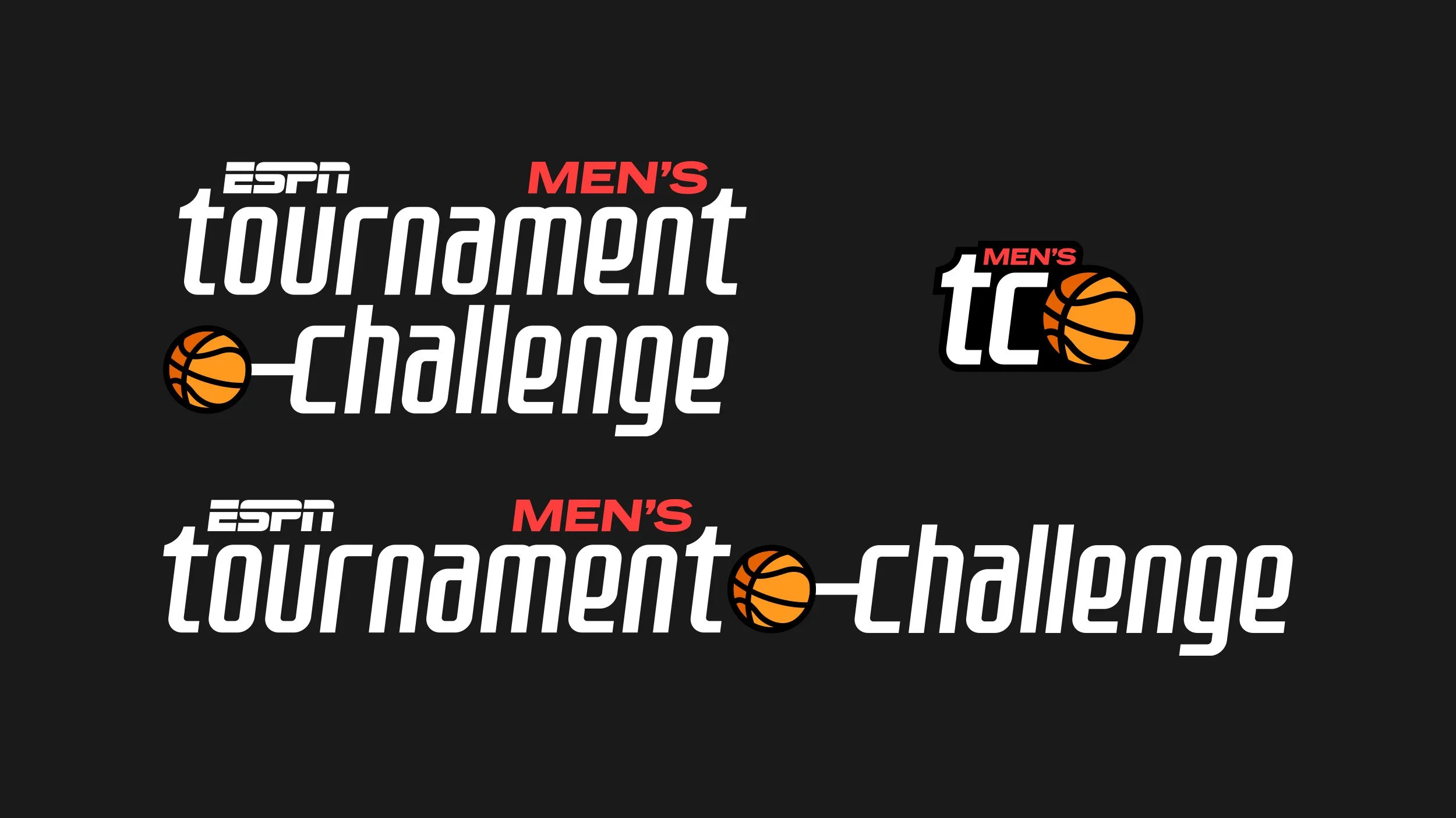
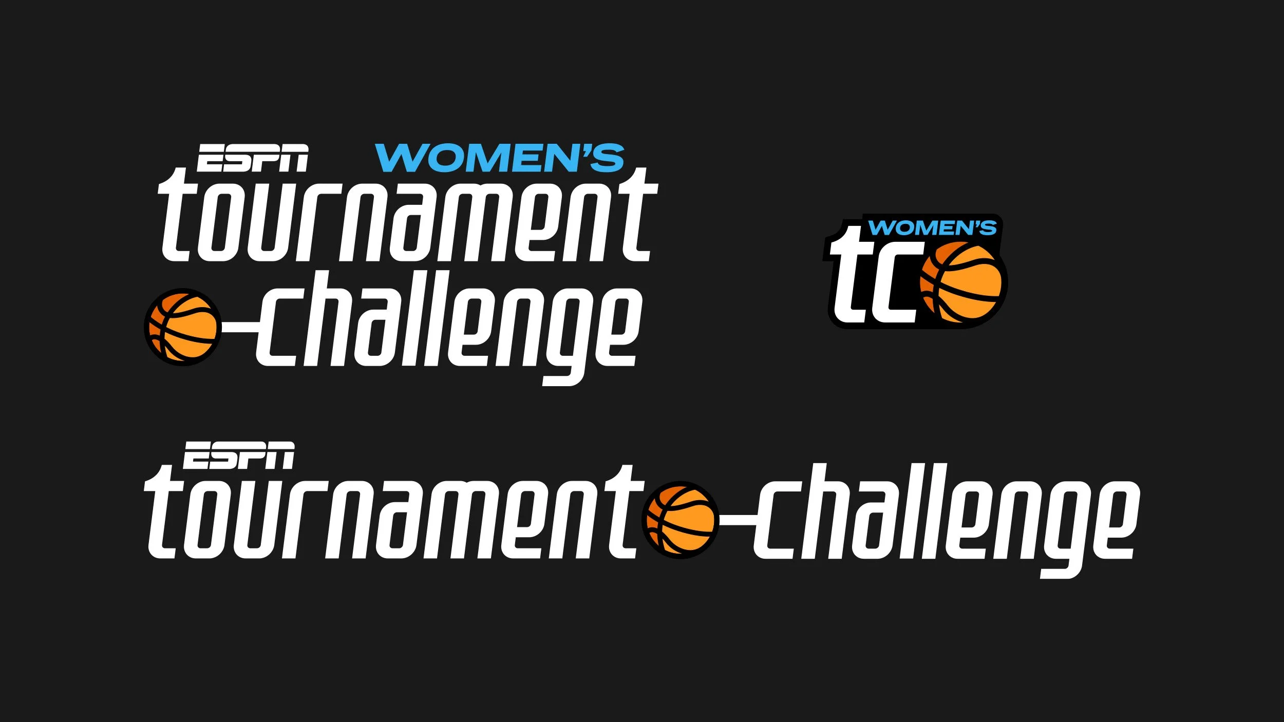
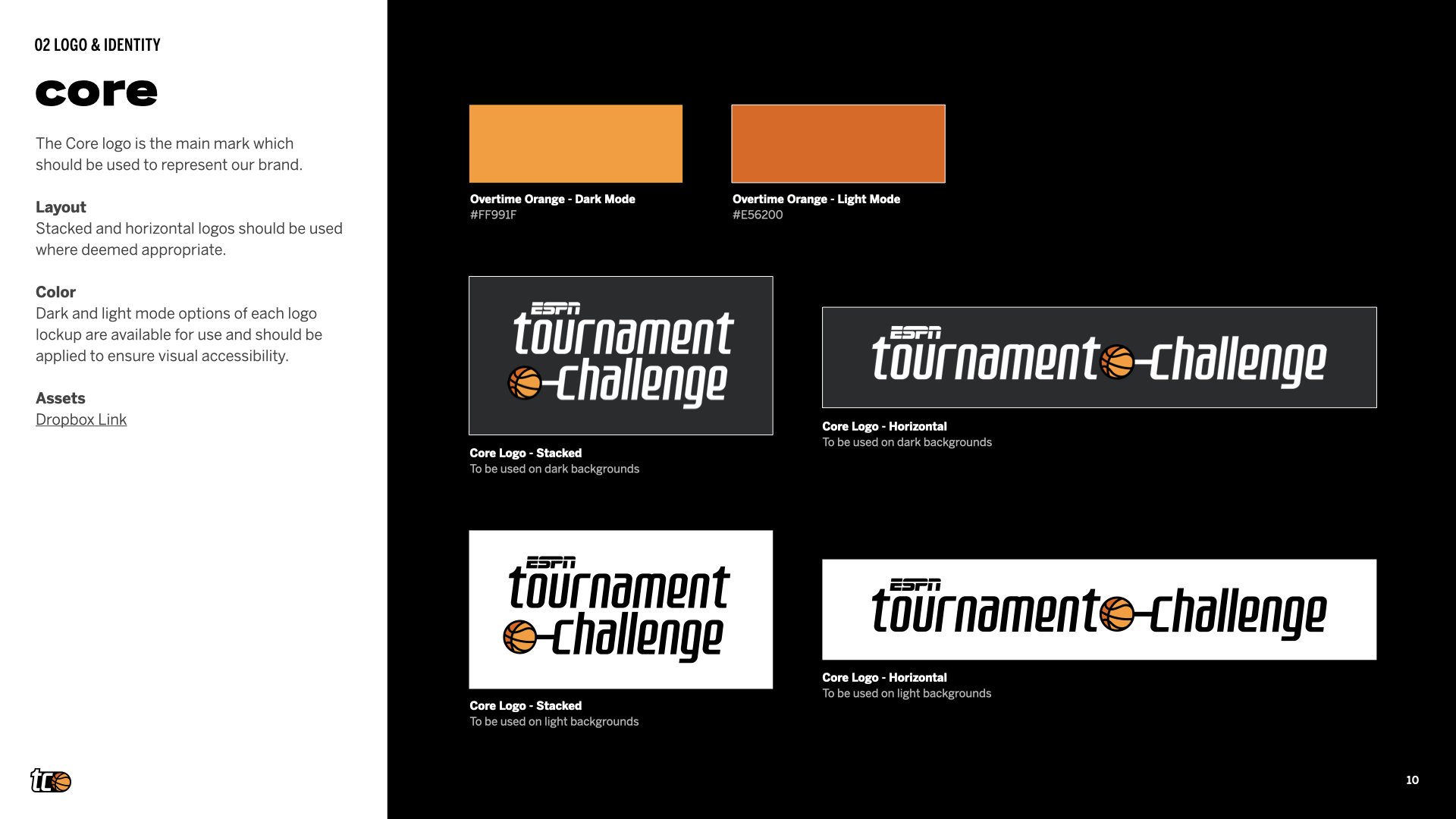
The redesigned logo balances the heritage of Tournament Challenge with a more modern, distinctive identity. A custom typeface brings personality to the mark, while orange serves as the unifying core color across both tournaments. Distinct secondary colors differentiate the Men’s and Women’s experiences while maintaining equal presence within the broader system.
Hand-made Textures & Patterns
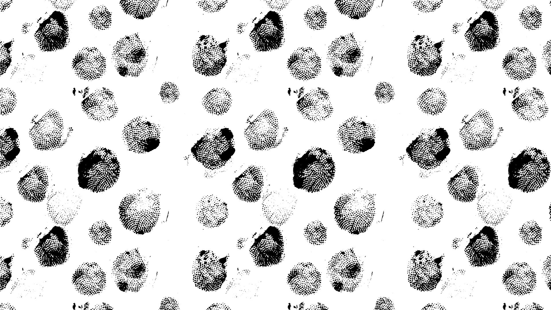
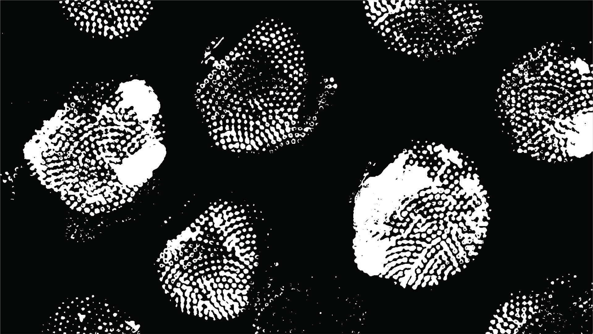
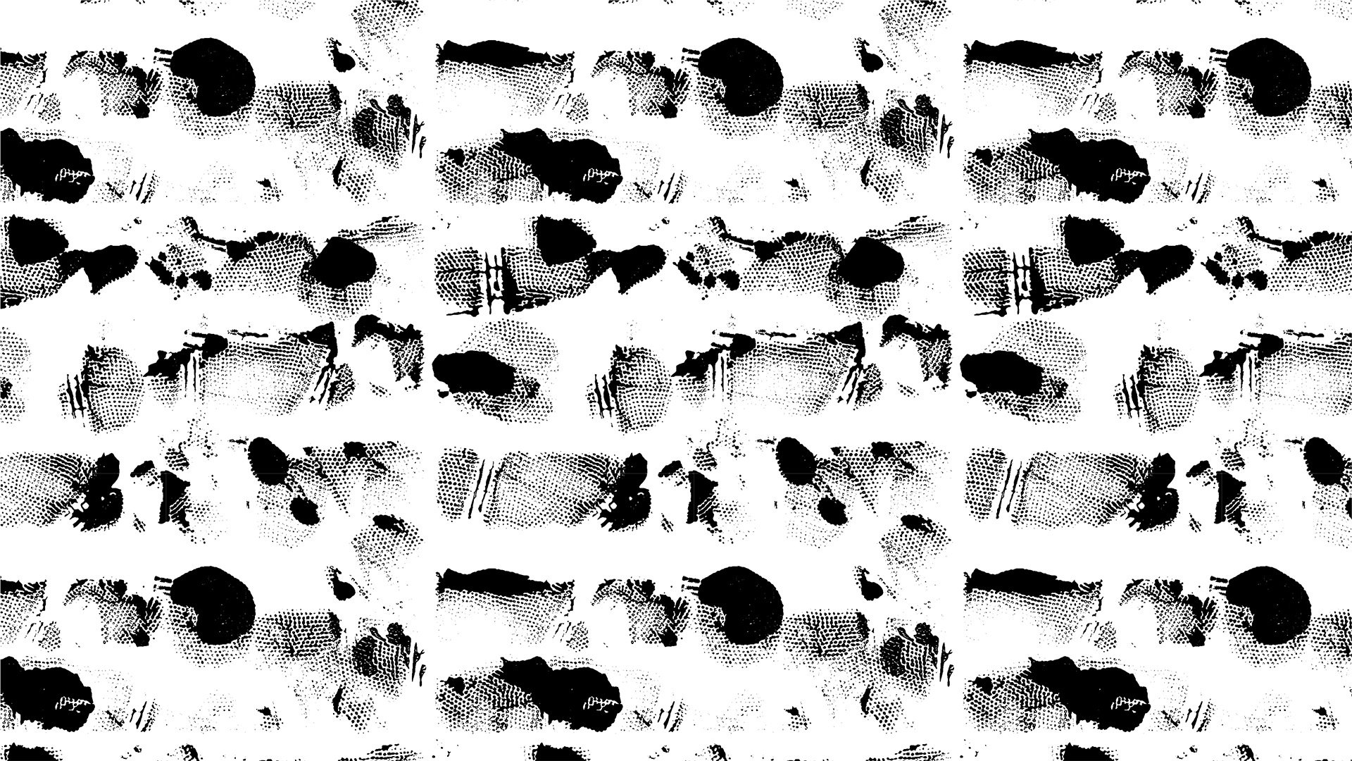
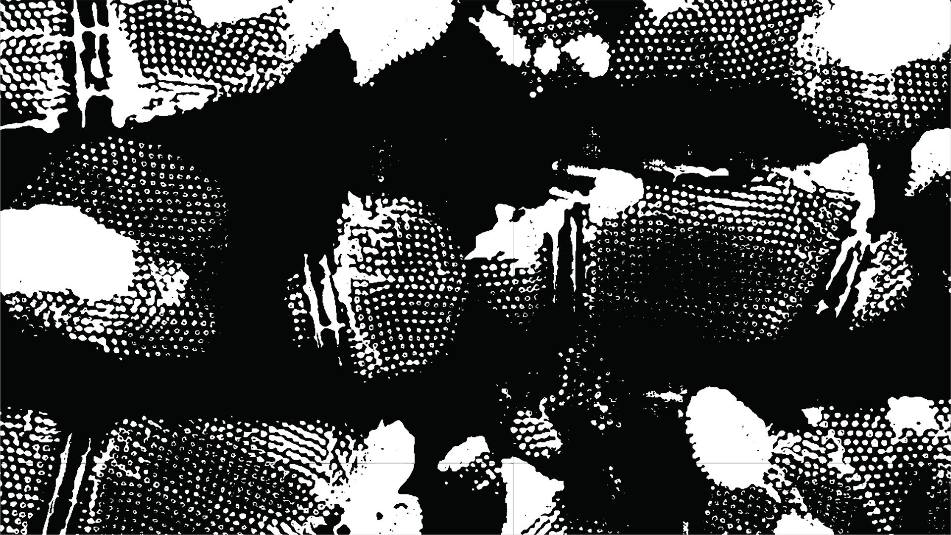
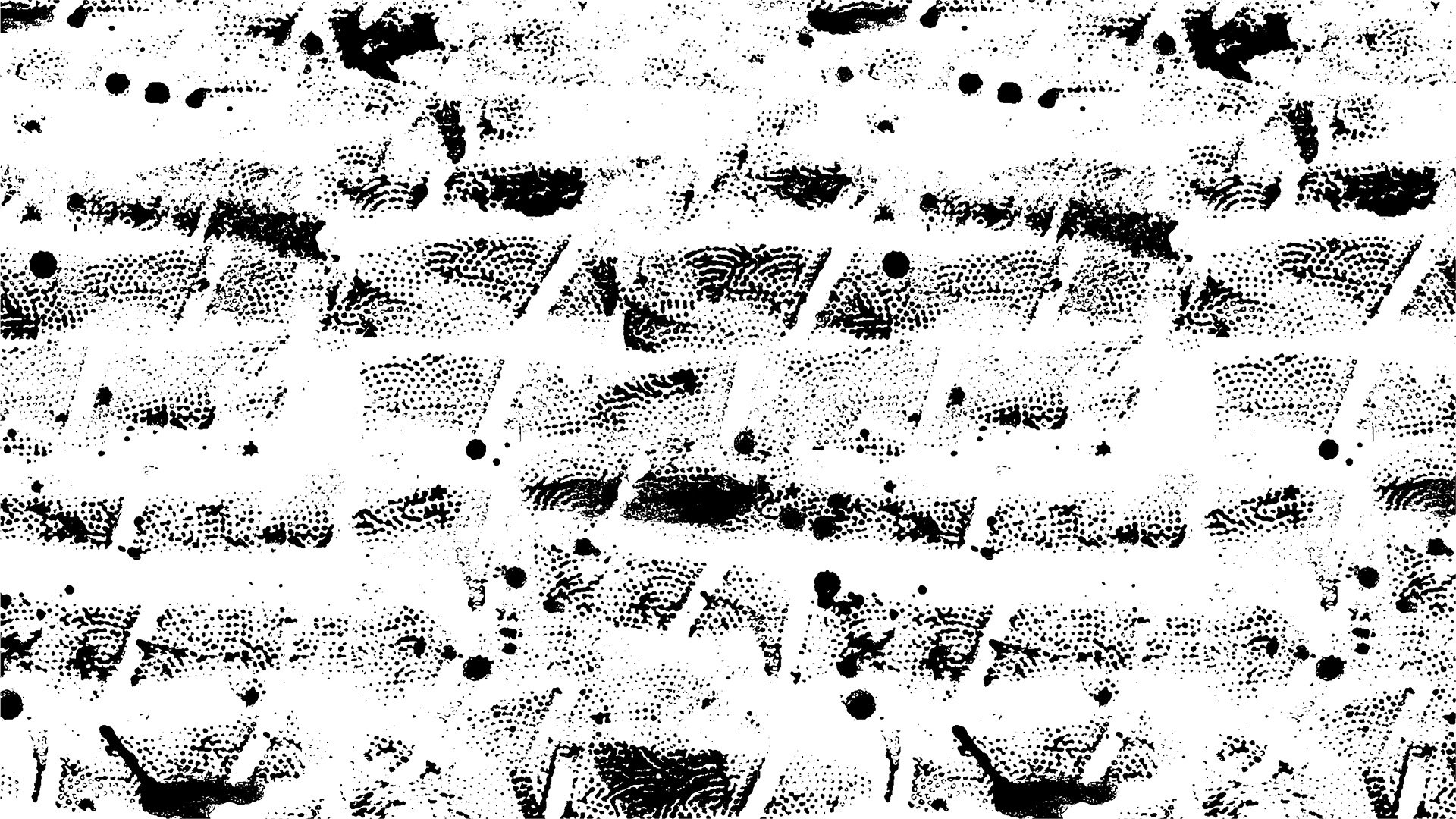
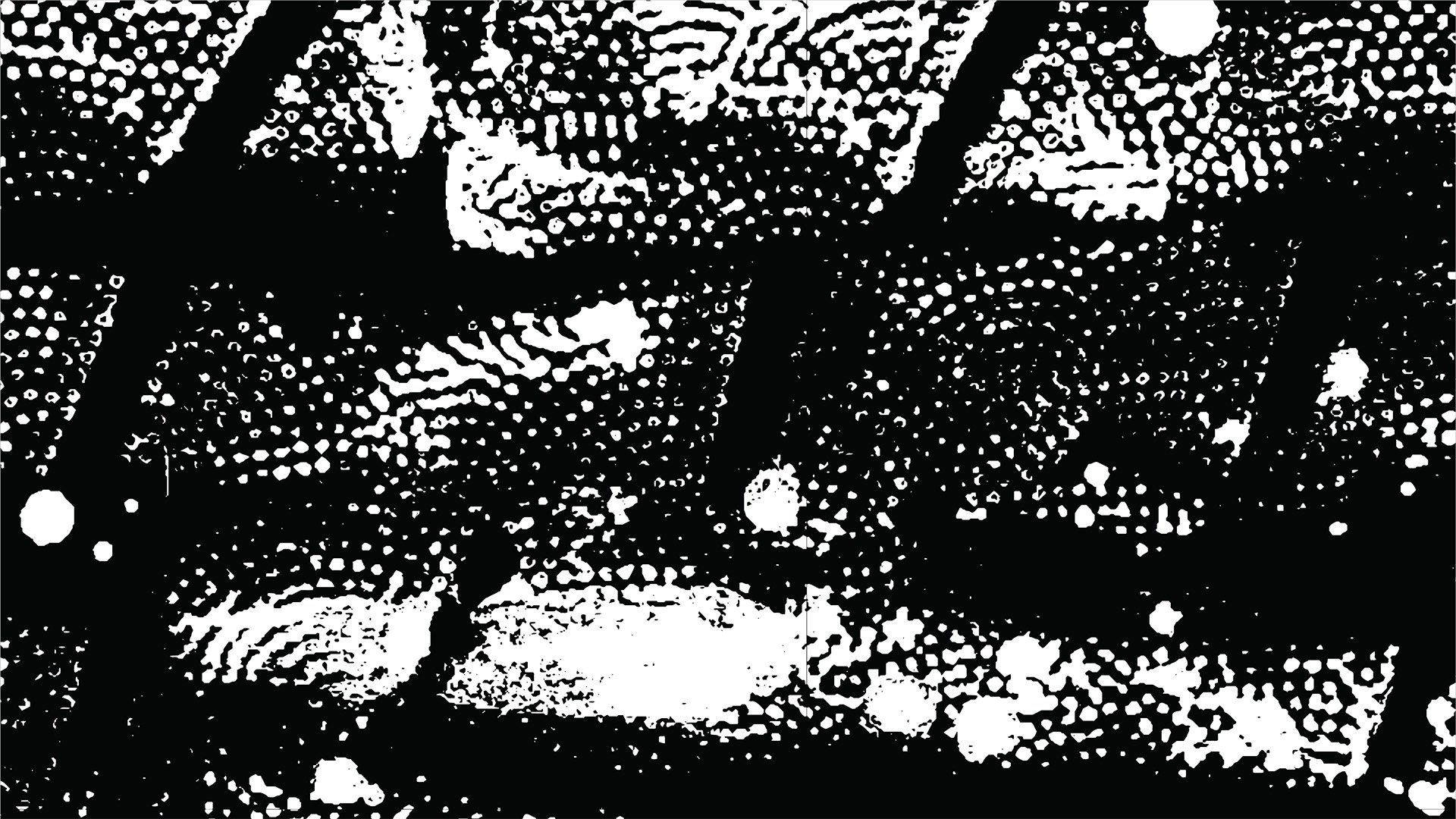
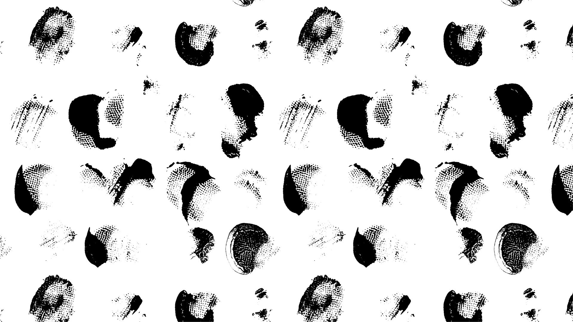
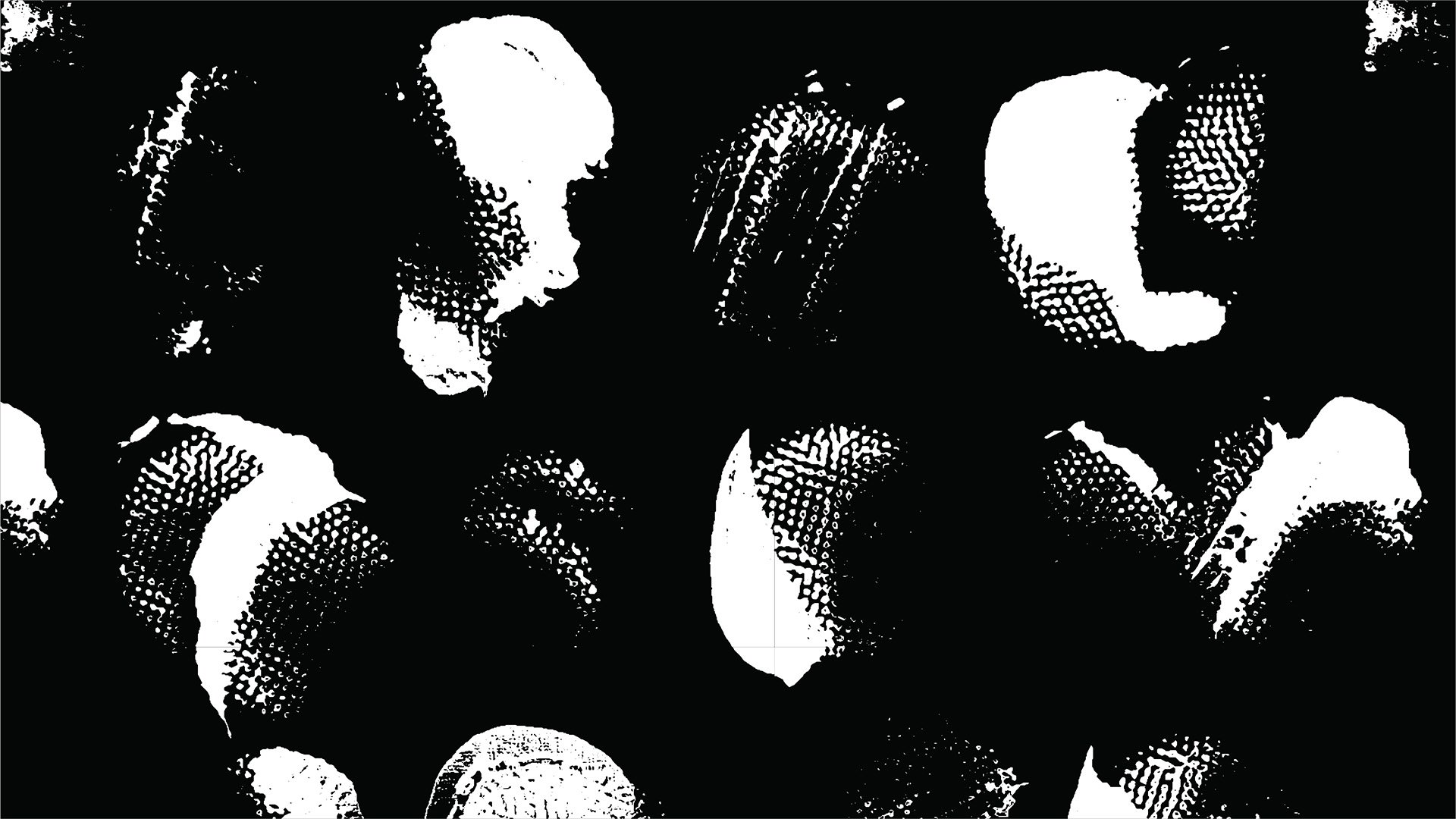
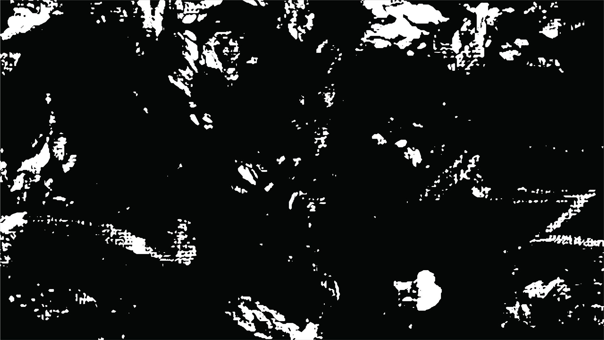
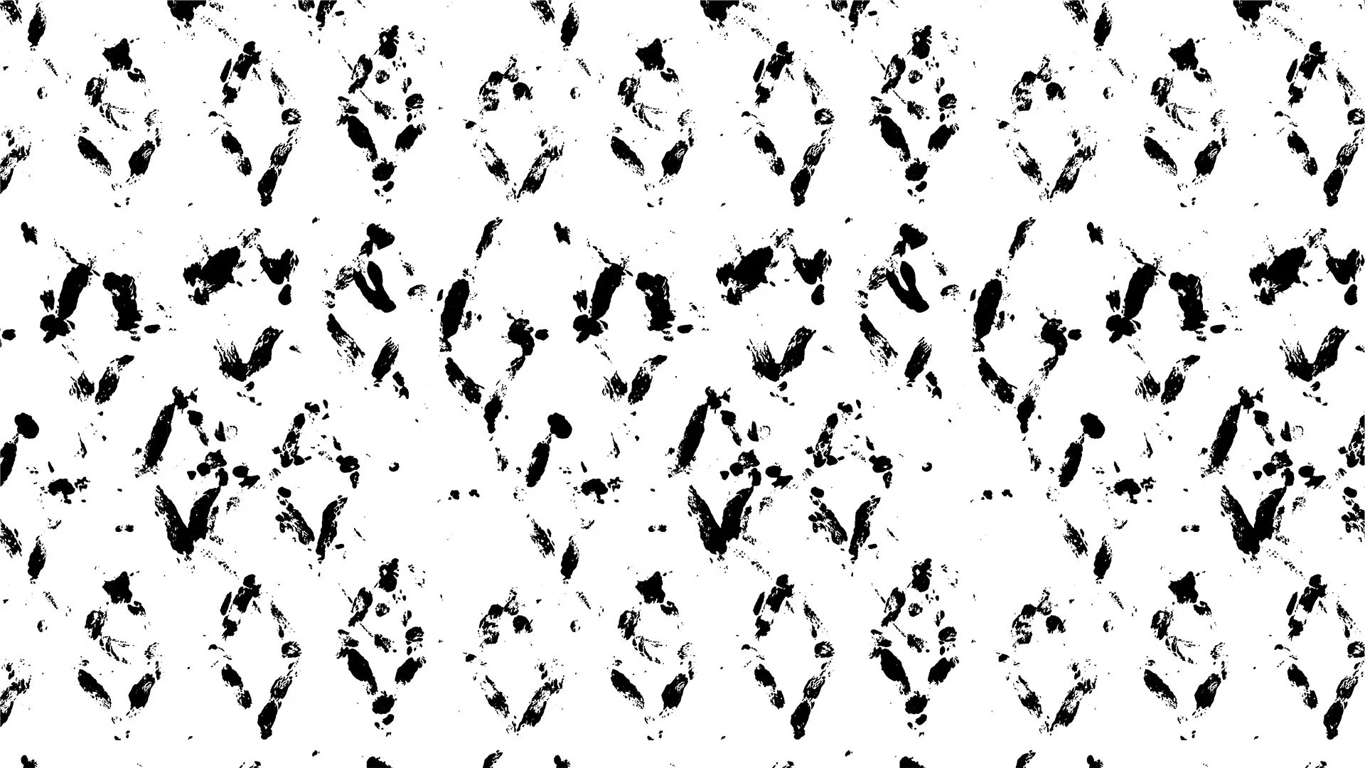
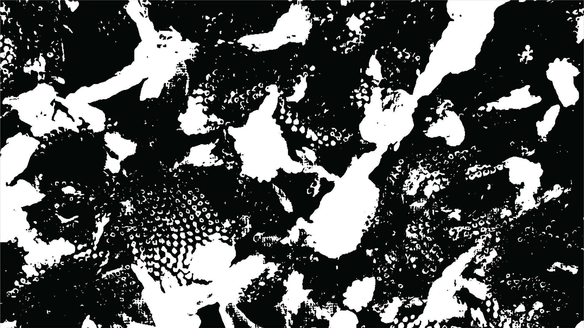
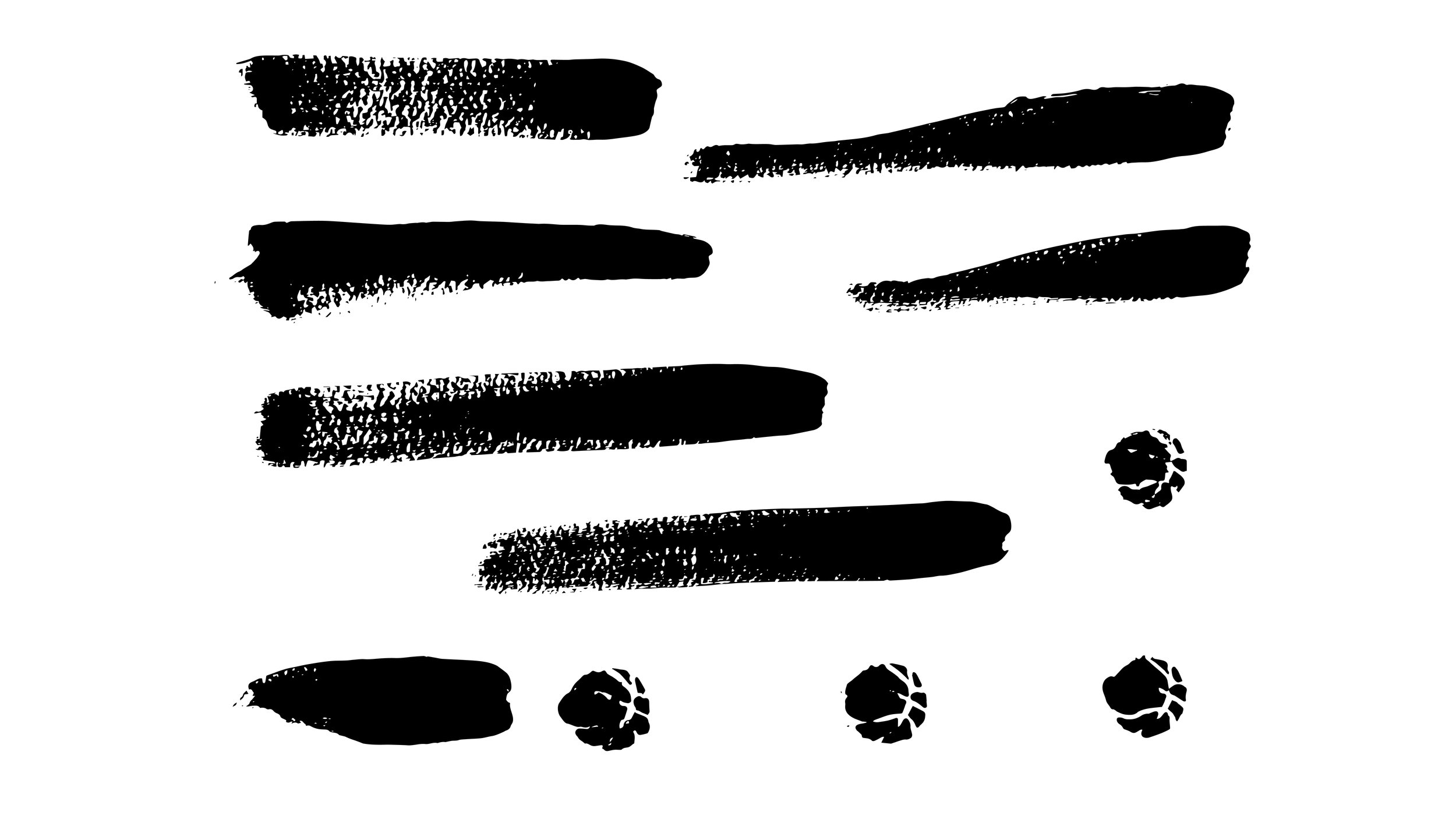
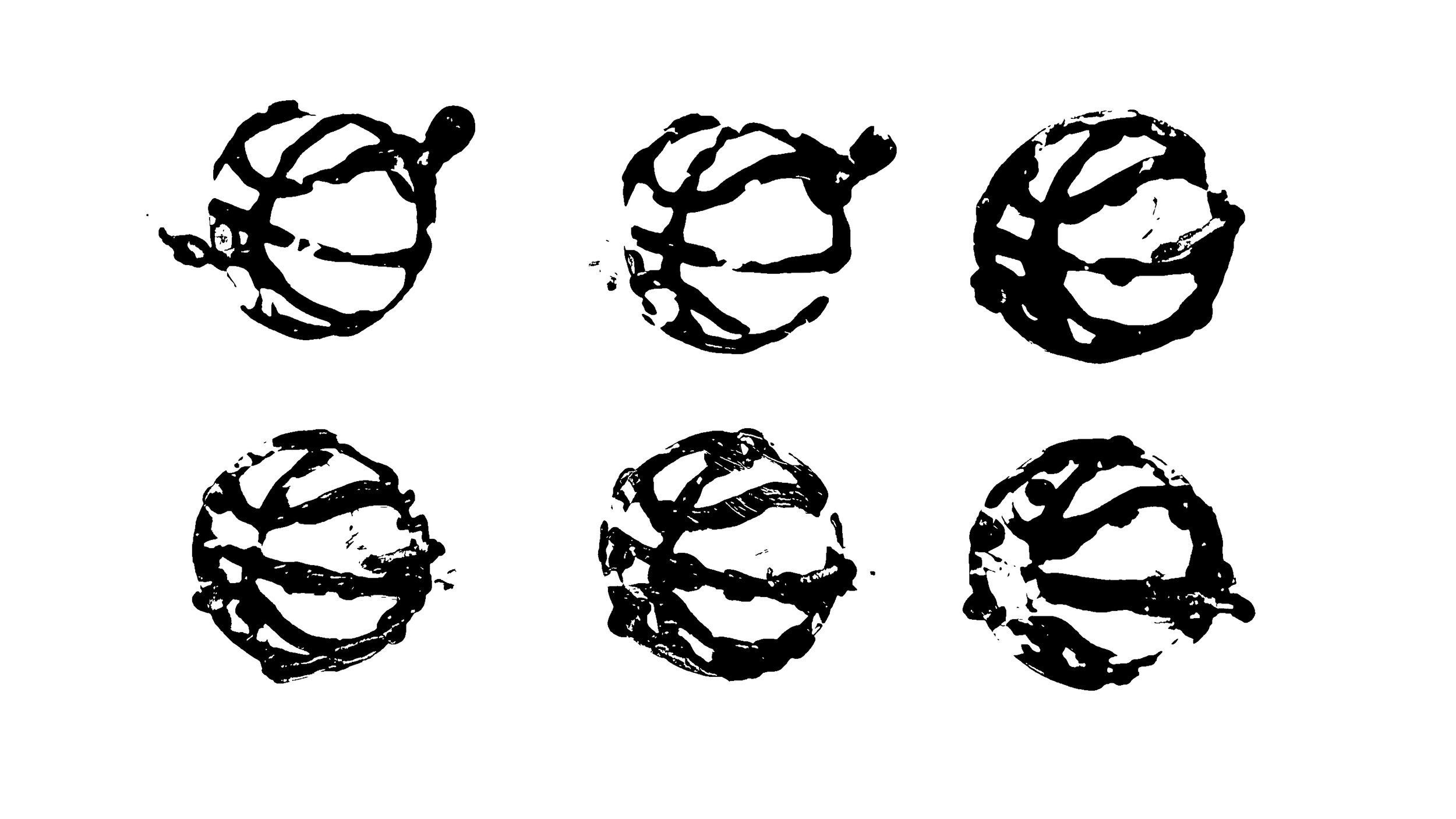
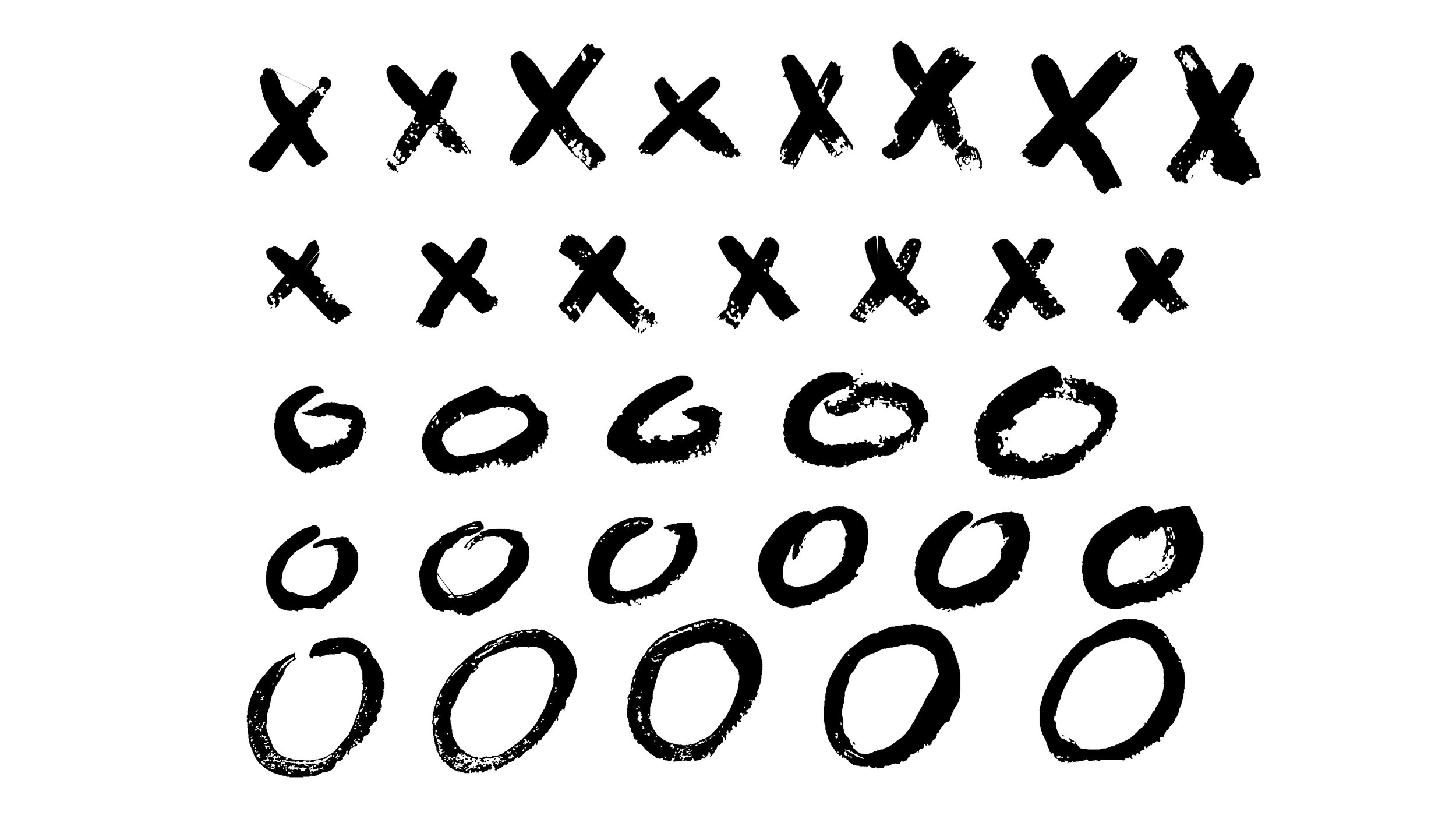
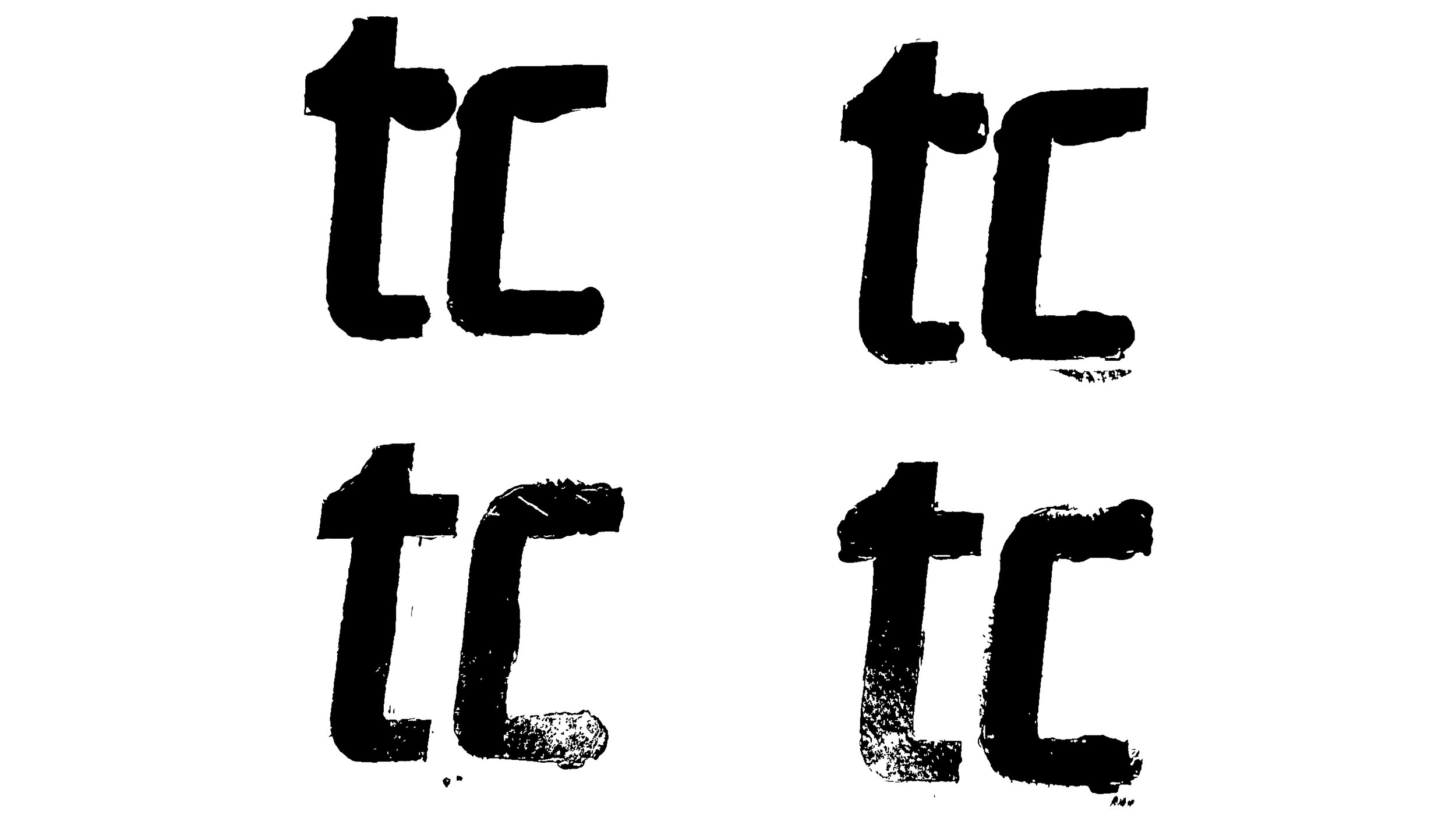
As we explored ways to contrast the clean, modern feel of the new logo, we kept coming back to halftone textures. That sparked an idea: what if we made our own? I proposed creating them directly from the materials of the game, using basketballs and nets to build a visual language unique to Tournament Challenge.
I dipped basketballs and nets in black acrylic paint to create physical impressions, which were then digitized and developed into a flexible pattern library. The resulting textures bring the energy, imperfection, and tactile nature of basketball directly into the identity.


These textures are comprised of the grip points (surface dots) that give the basketball its iconic look.
Grip Points
Nylon Net
These textures focus on the signature diamond shape of the basketball net and the tradition of the champion team cutting off the net.

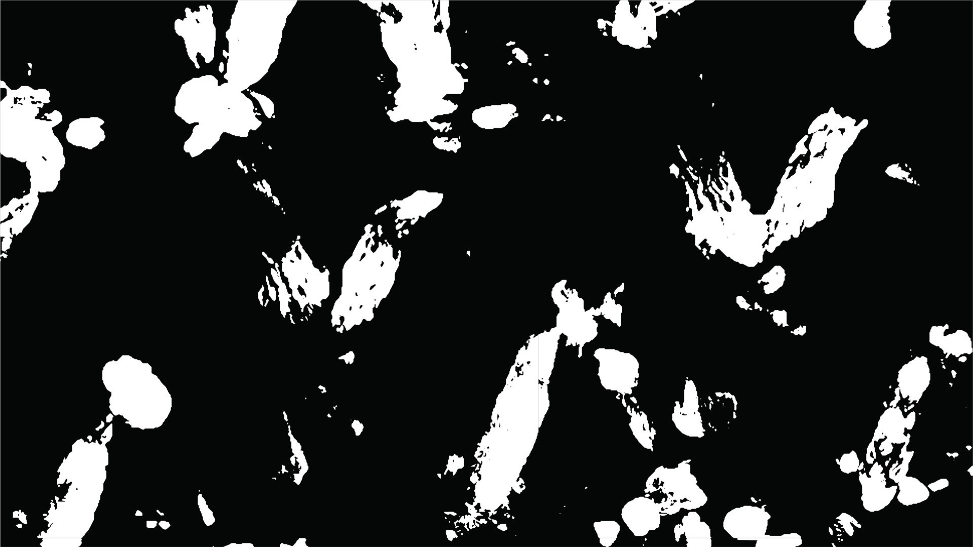
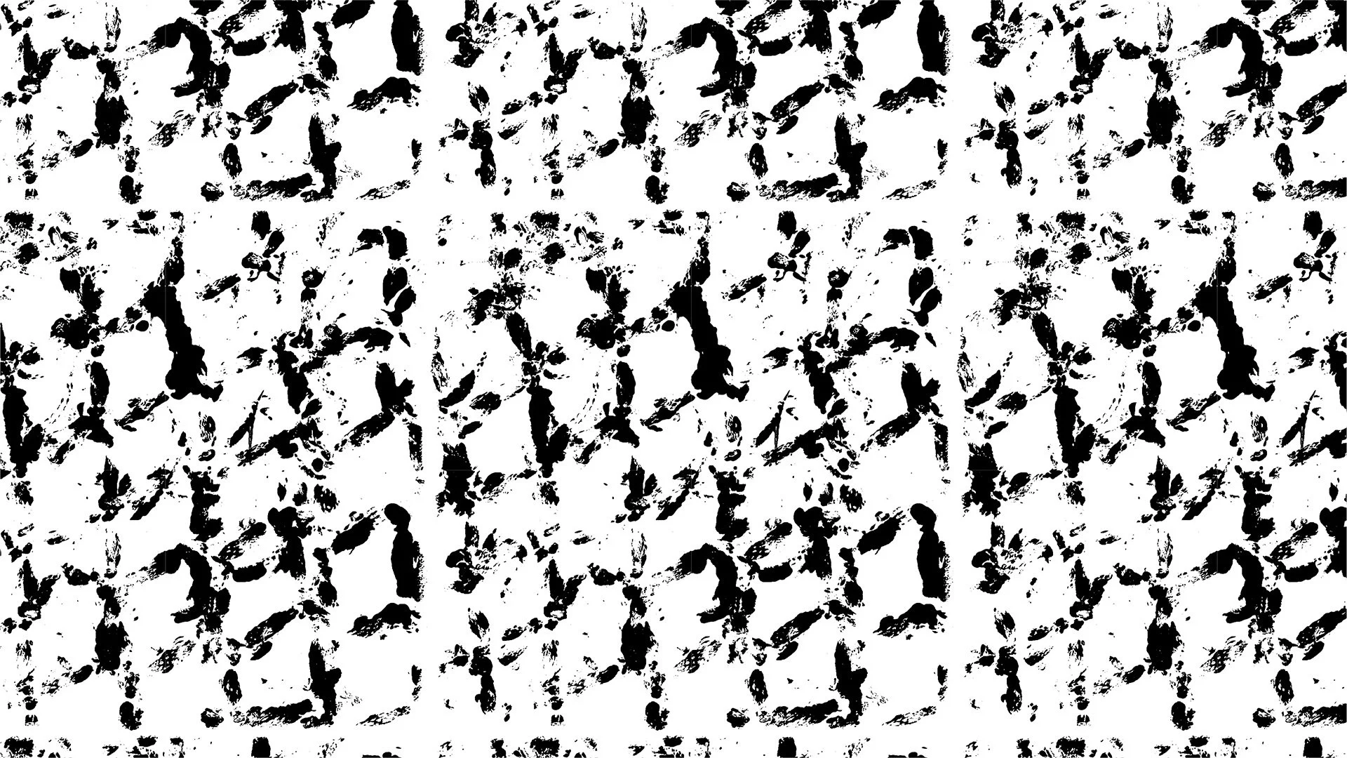
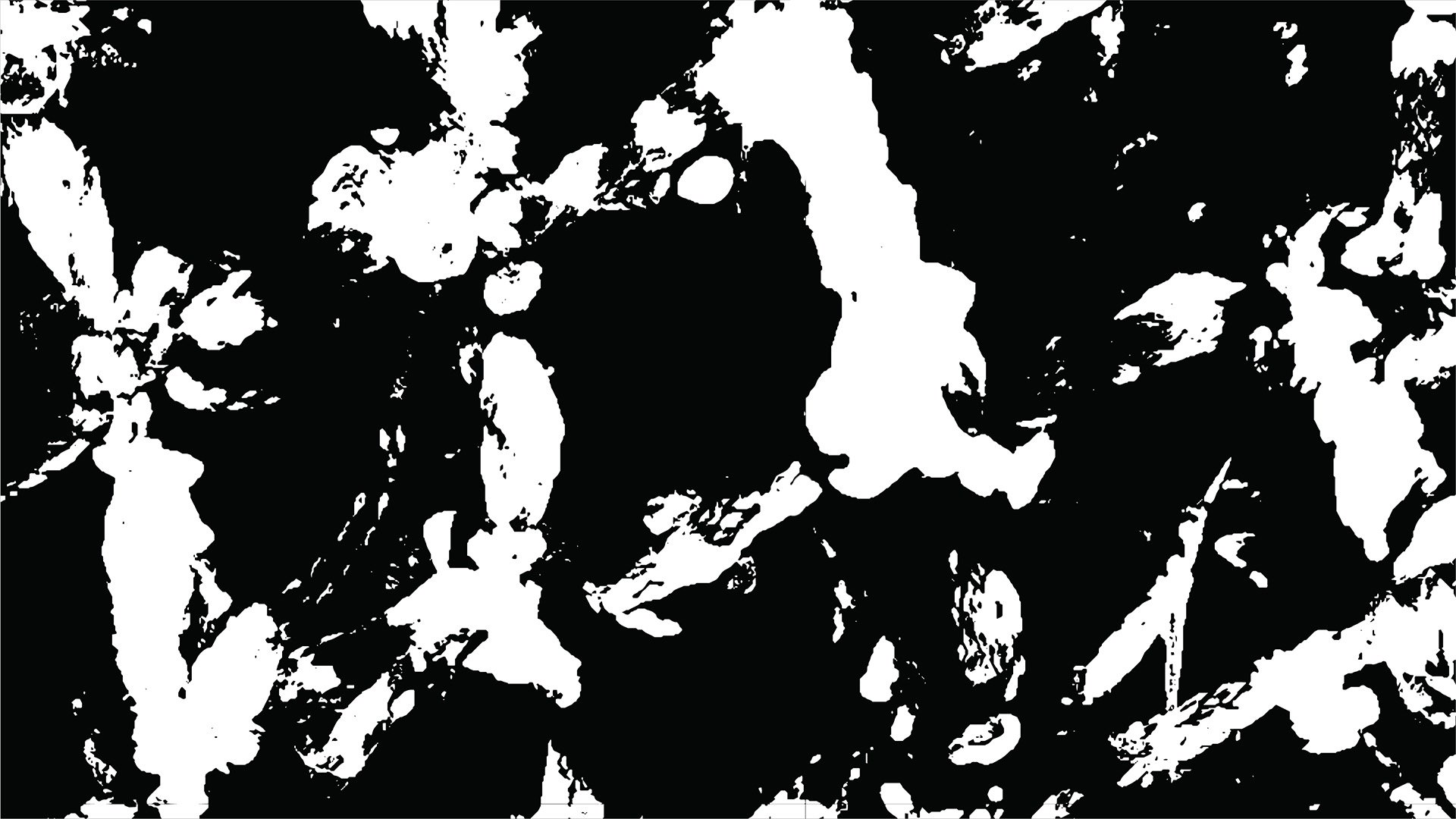

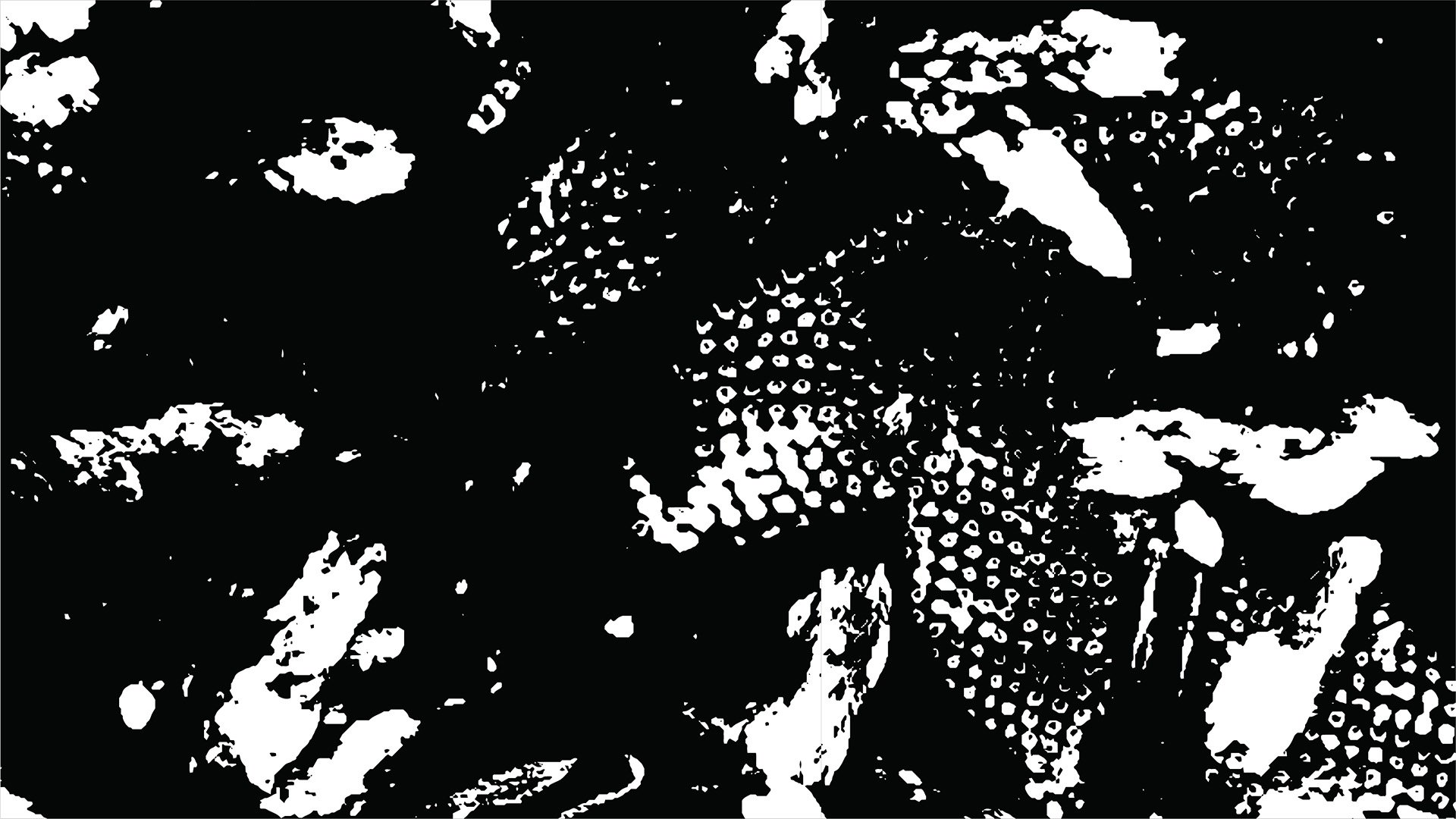
Courtside
These textures capture the energy found only on the court itself and are a combination of basketball and net prints.




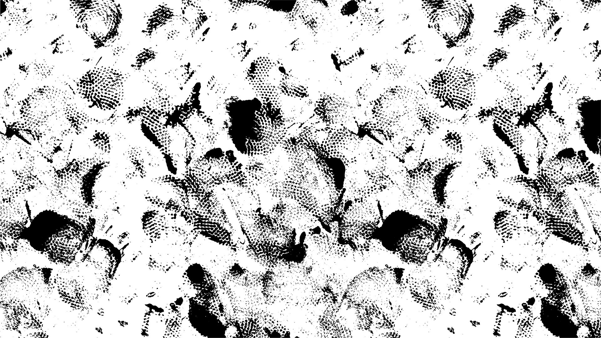
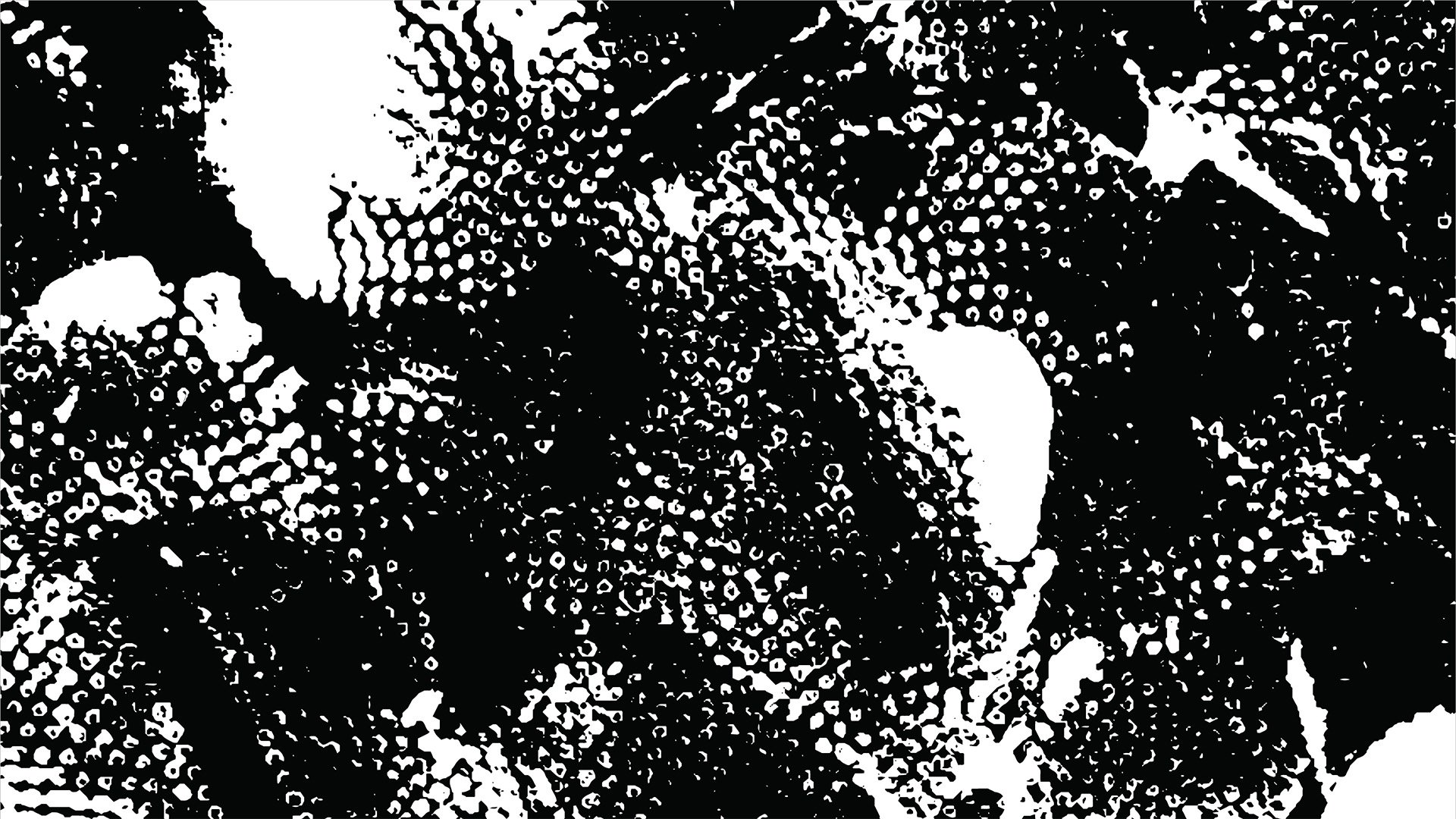

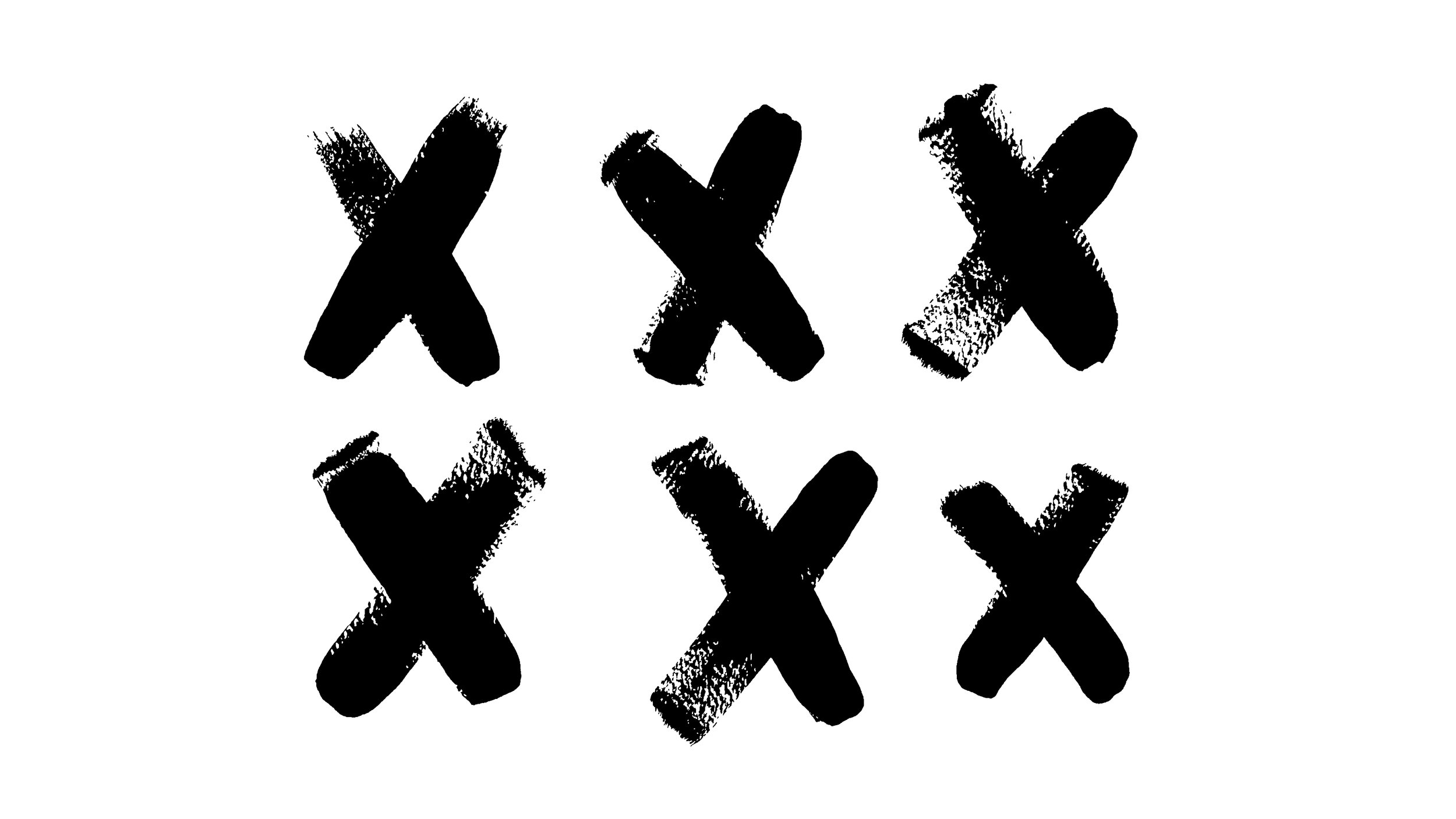
Icons
After developing the textures, I expanded the visual language with a set of custom, hand-drawn icons inspired by basketball play diagrams and the energy of the game.

Brand Guidelines
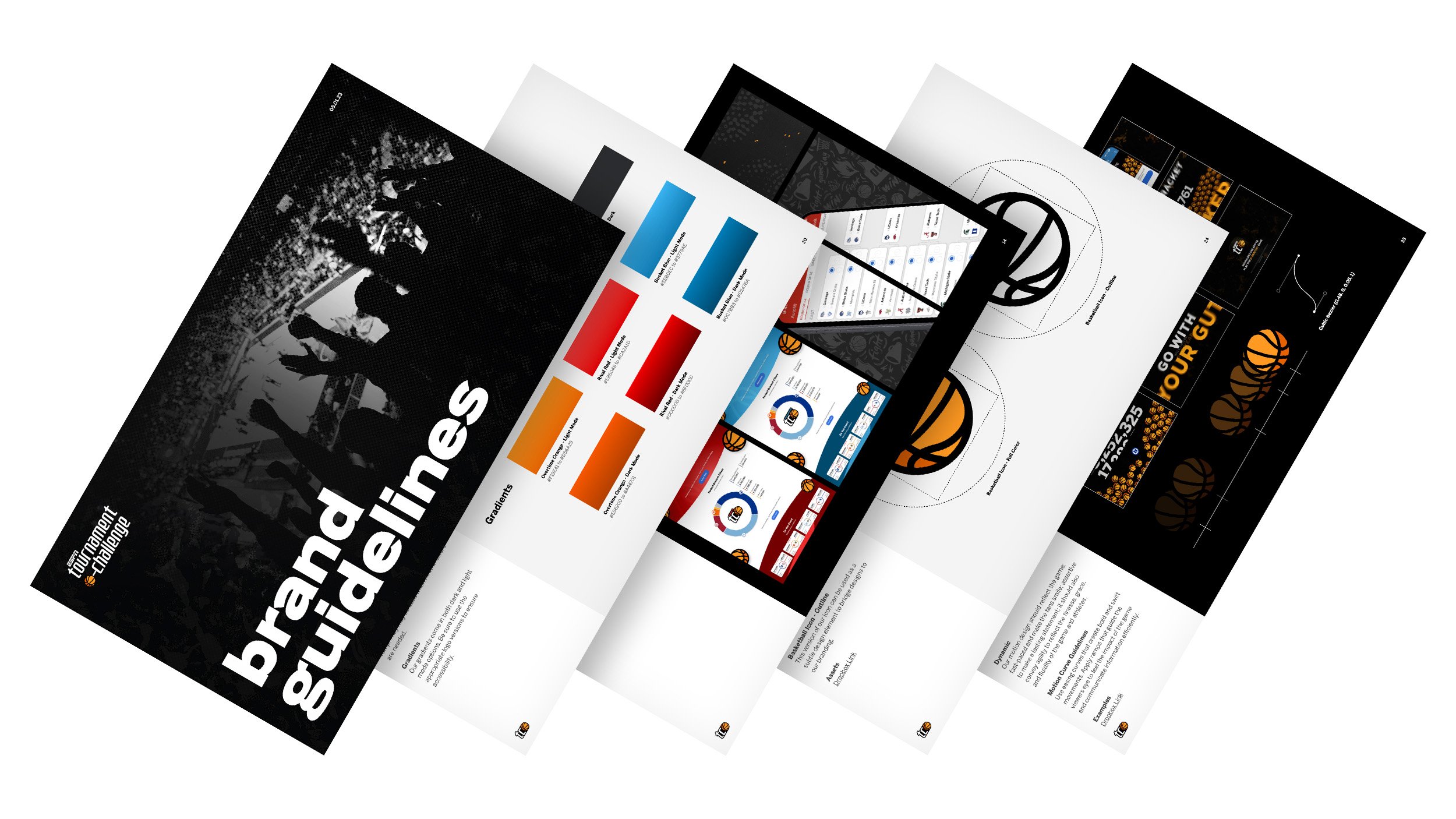
What’s the best part about completing a rebrand? That’s right: brand guidelines, y’all!
Bringing the full system together gave me the opportunity to collaborate with our Content and Motion Design teams to define how the Tournament Challenge brand should look, sound, and move. The resulting guidelines brought our visual system, brand voice, and motion principles into one cohesive resource that was handed off to ESPN’s broadcast and marketing teams to help maintain consistency across promotional materials.





Impact
25.8M
TOTAL BRACKETS CREATED
9.4M
Men's Players
↑ 15% YoY
1.6M
Women's Players
↑ 45% YoY
3.2M
Women's Brackets
↑ 56% YoY
More from ESPN
A selection of additional work created across ESPN, spanning major sports moments, digital campaigns, and in-app experiences.
ESPN Highlights / Braze Campaigns
Visual Design · Digital Campaigns · Motion
Role
Visual Designer
Contributions
Campaign Design, Art Direction, Photo Compositing, Motion Design, In-App Creative
Creative Director
Angelica Mckinley
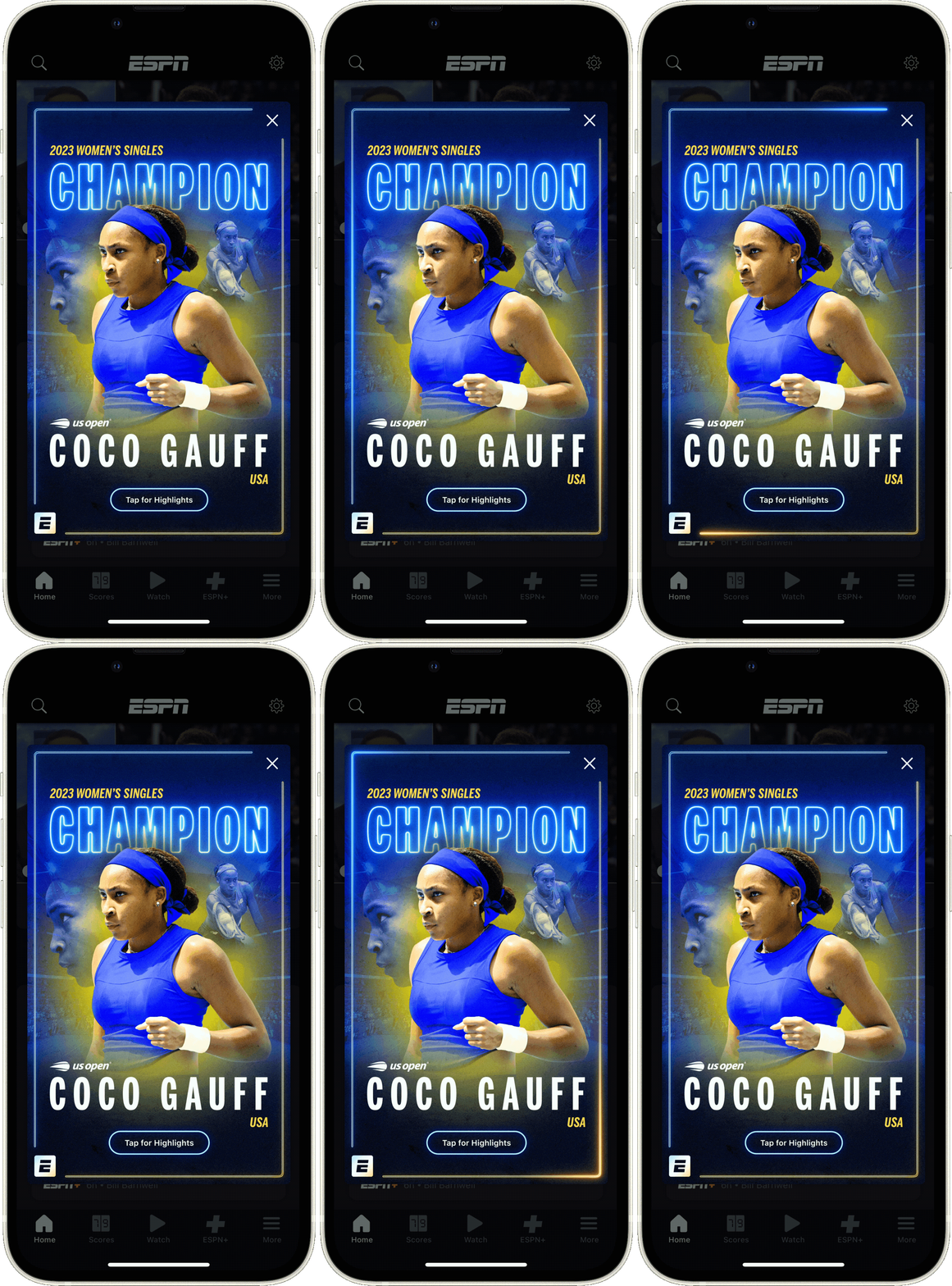
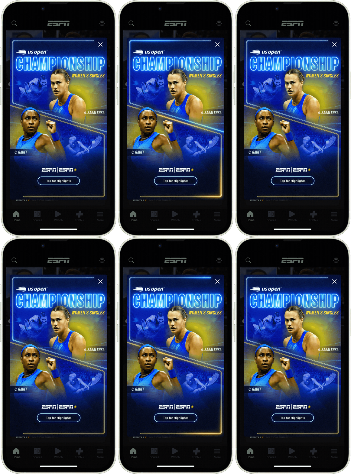
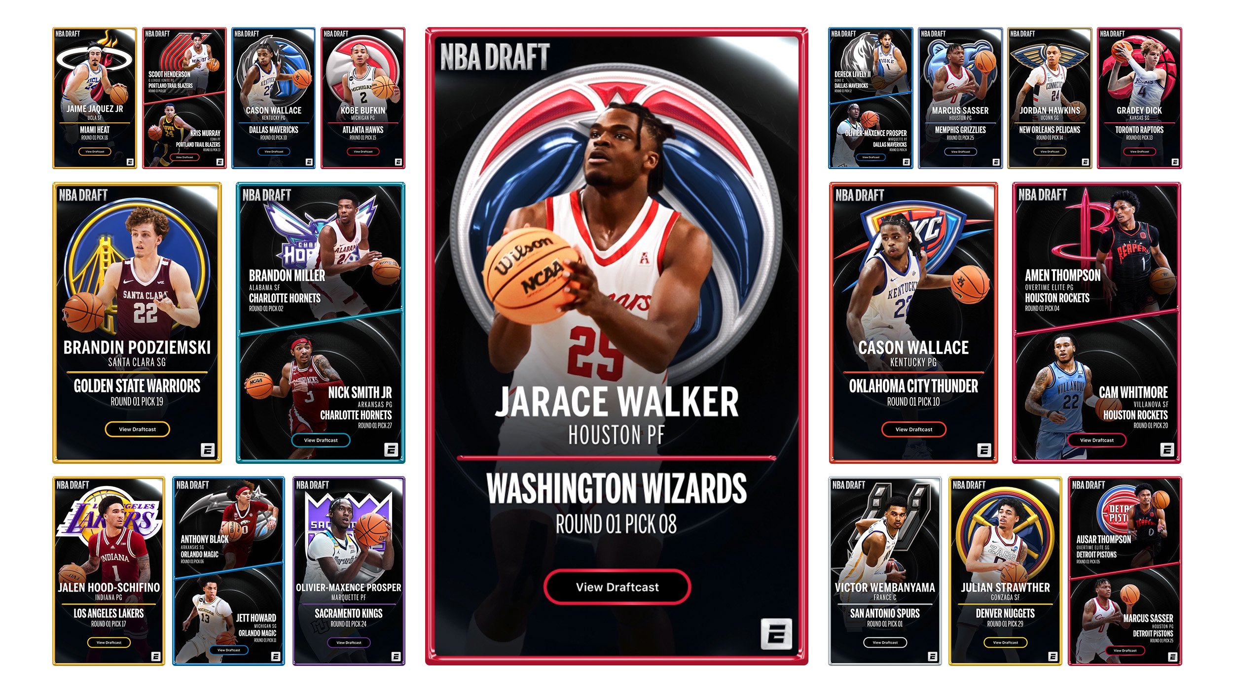
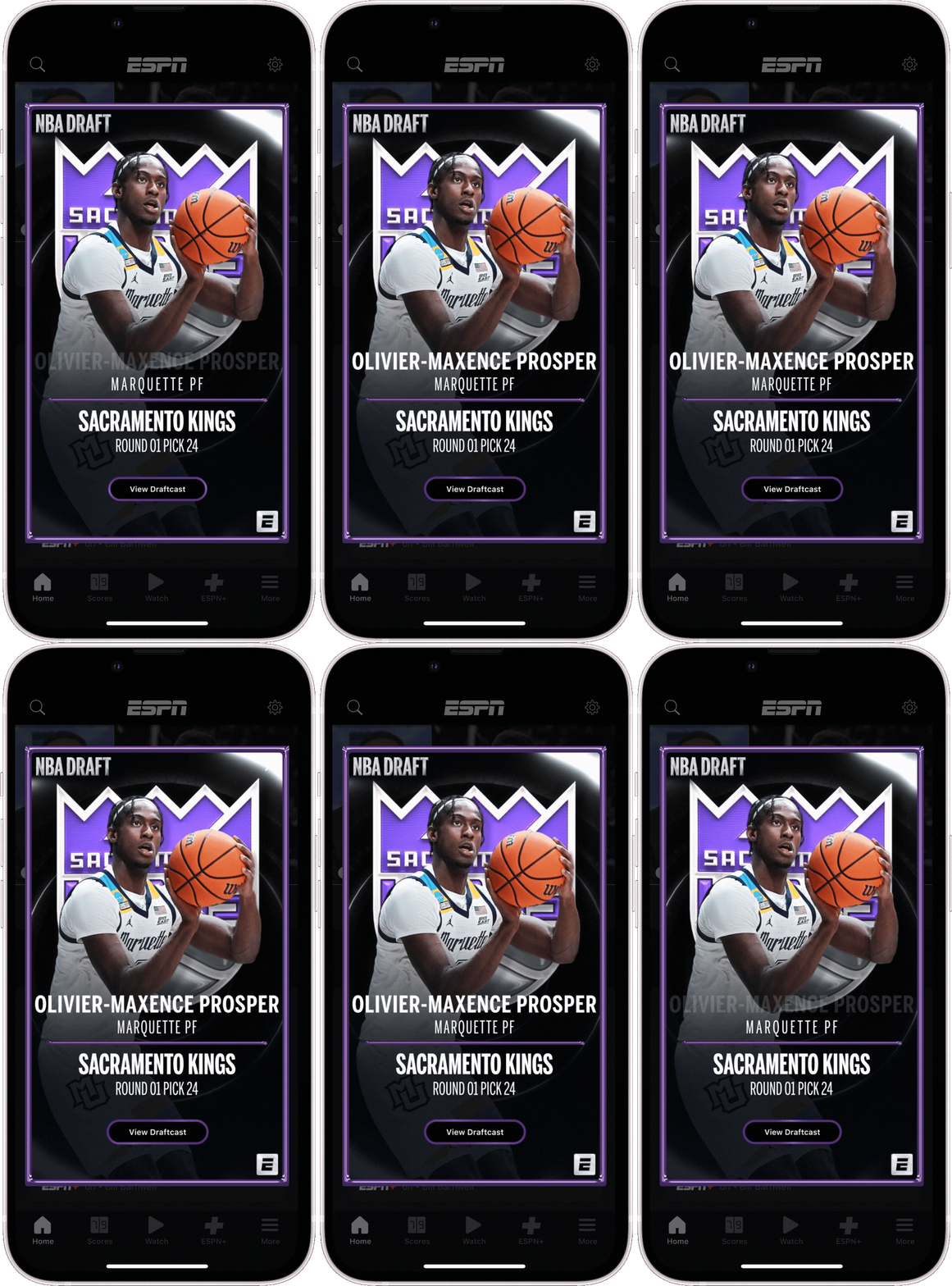
Sports are all about celebration, right? That idea inspired a series of intentional, recurring highlights across the ESPN app using Braze. Through targeted in-app experiences, we celebrated major moments across the sports calendar - - from championship wins to marquee events.
I led the design for campaigns including the 2022 Heisman winner, Super Bowl LVII, NBA Draft, and US Open, developing visual concepts and select motion experiences tailored to each event.
US Open 2023 — Motion Design



NBA Draft 2023 — Campaign Design
Motion Design
Jesse Gilbert




More Featured Work

Marvel
Marvel Unlimited, Marvel Made + digital experiences

Disney
Disney Homepage, DisneyNOW + selected work
Meeq: Inherit Rebirth
Brand identity, art direction + visual storytelling