
Marvel Unlimited Sell Page Redesign
Brand Identity · Visual System · Digital Experience
Role
Product Designer
Contributions
UX Strategy, UI Design, Visual Design, Responsive Design, Prototyping, Motion Design
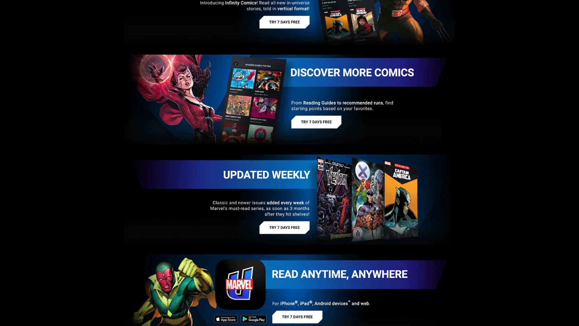
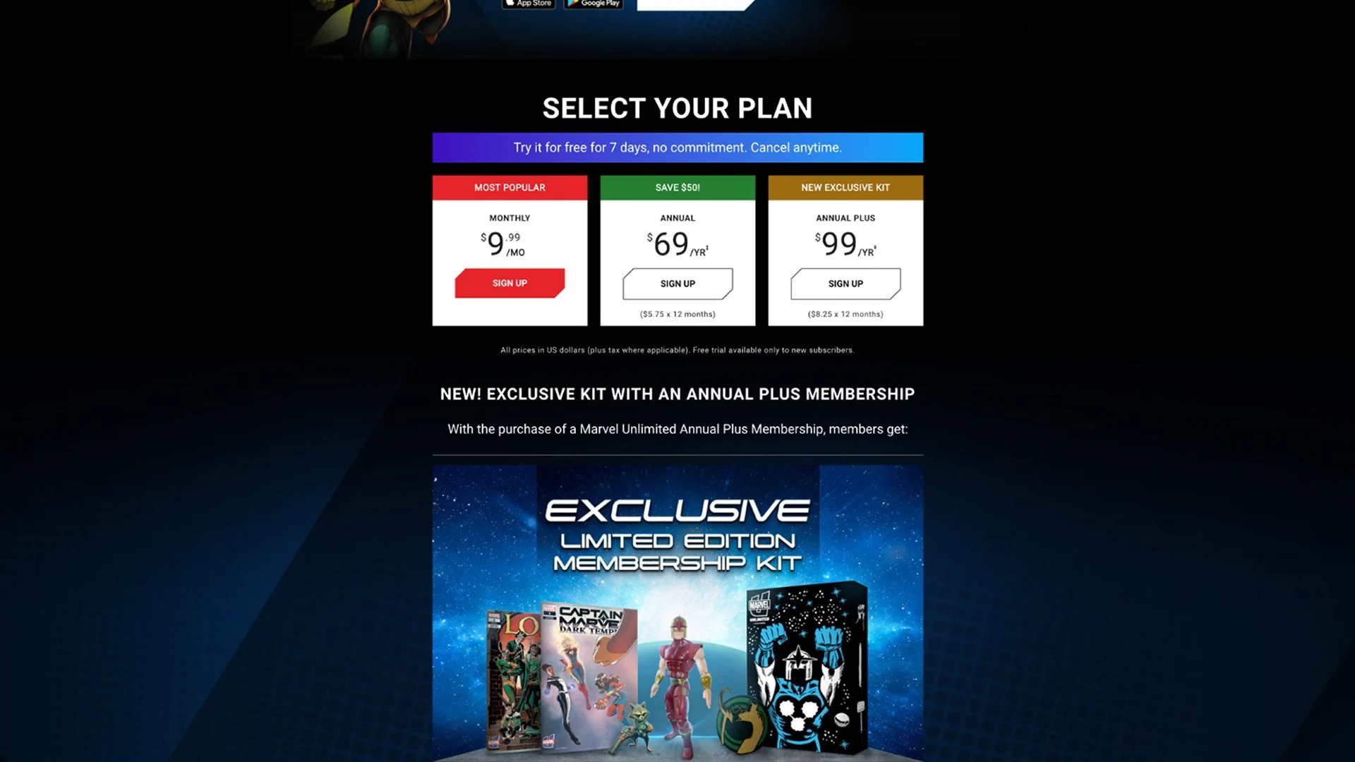
I led the end-to-end redesign of the Marvel Unlimited sell page - - the primary destination for introducing the digital comics subscription service and guiding users toward one of its three subscription options.
The existing experience presented challenges for both users navigating the subscription offering and Marvel teams creating promotional campaigns. I redesigned the experience from the ground up, from early UX exploration and wireframes through final UI, responsive design, and motion, creating a more engaging and flexible experience designed to better communicate the value of Marvel Unlimited and support conversion.
The Challenge
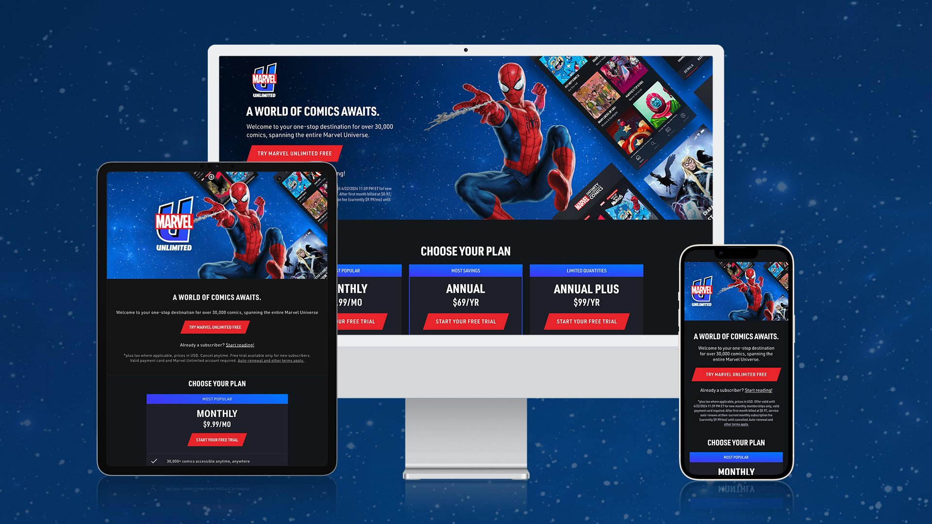
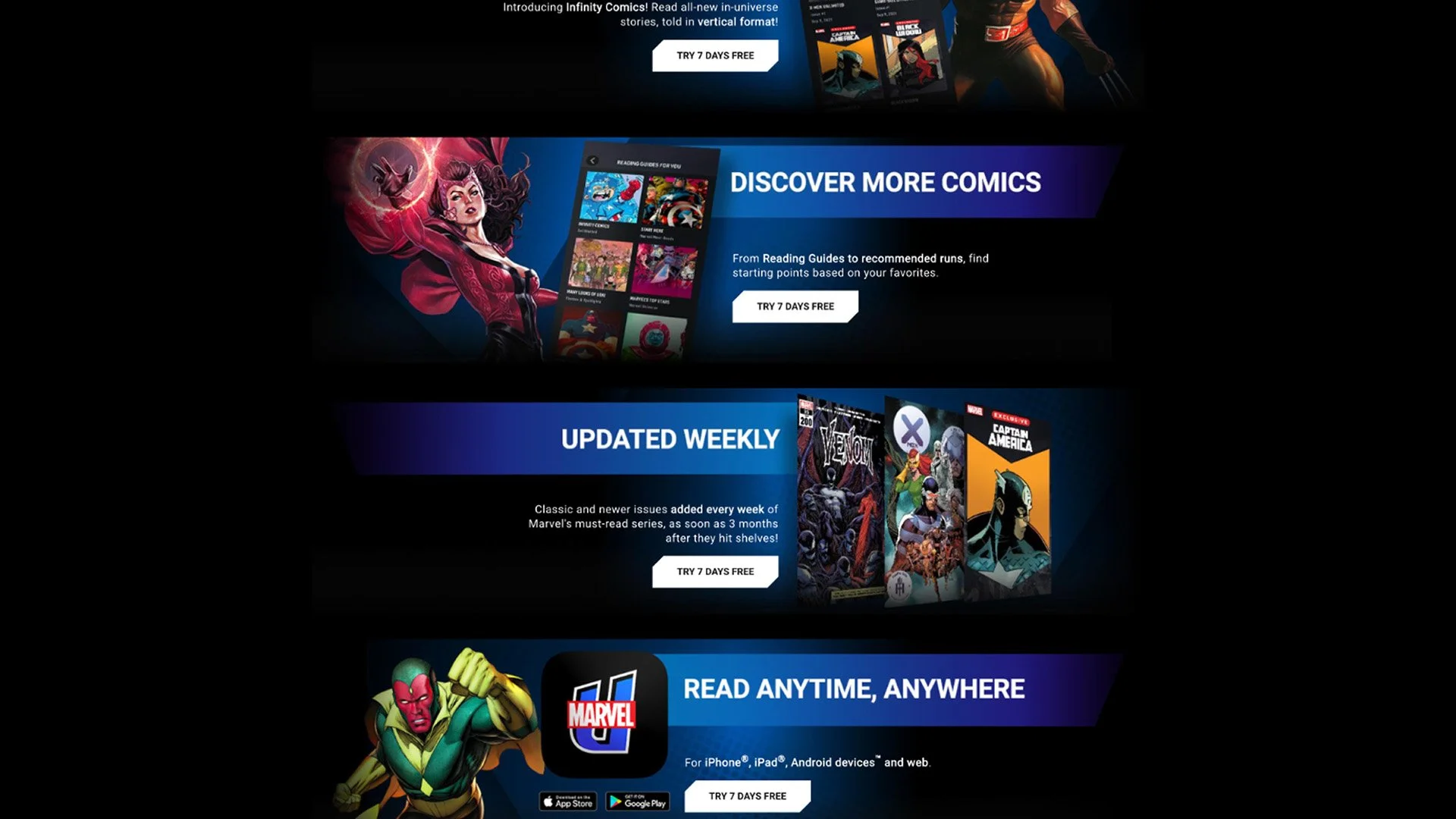
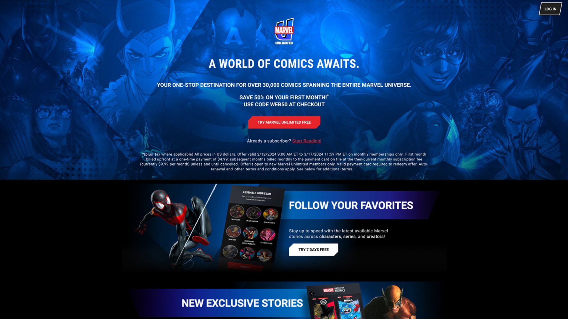
The existing Marvel Unlimited sell page had gone years without a major redesign and presented challenges for both users and our Marketing team. Subscription options—the primary conversion point—were buried near the bottom of the experience, while repetitive promotional sections and a copy-heavy hero made the page difficult to navigate and increasingly challenging to keep accessible.
Behind the scenes, the page was built as a standalone HTML experience, making promotional updates difficult for Marketing. The redesign needed to simplify the path to subscription while creating a more flexible, accessible experience that could take advantage of reusable components within the Marvel.com CMS.
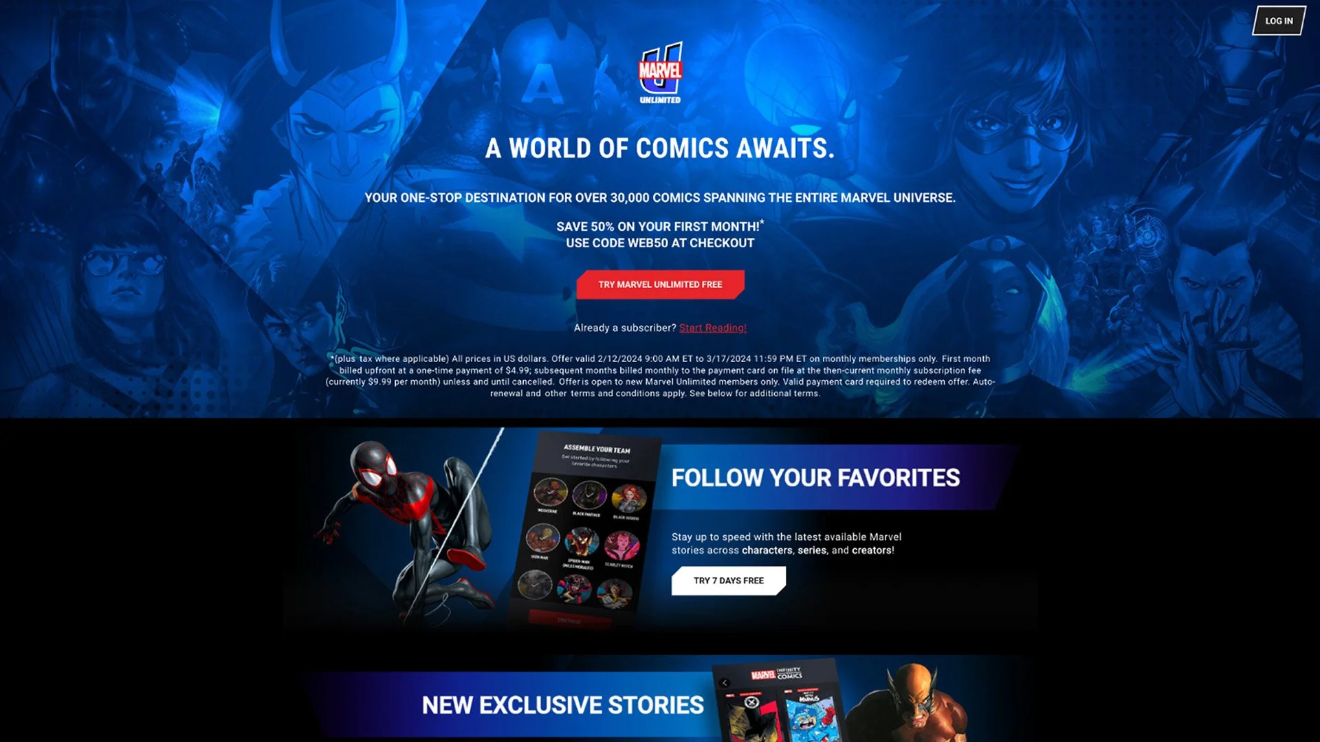
01 — Copy-Heavy Hero
Centered promotional and legal copy competed with character artwork, creating readability and accessibility challenges.
02 — Too Many Competing Messages
Repeated promotional sections and CTAs created visual noise and made it difficult to establish a clear content hierarchy.
03 — Limited Content Discovery
The experience had few opportunities to showcase the depth of Marvel Unlimited’s library or highlight timely and relevant content.
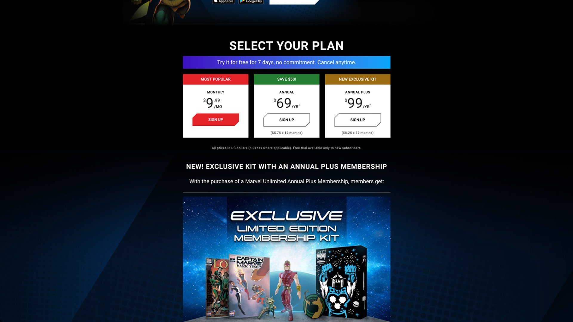
04 — Pricing Came Too Late
Subscription options—the page’s primary conversion point—didn’t appear until near the bottom of the experience.
Competitive Analysis
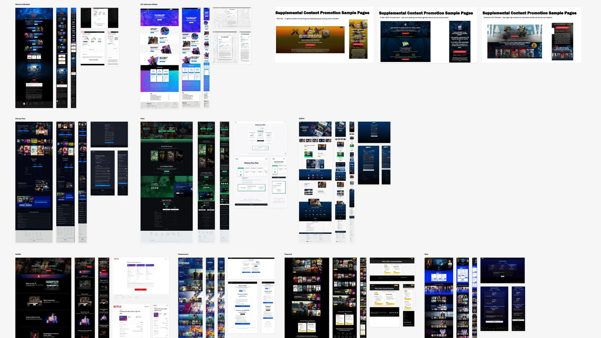
I reviewed leading subscription and entertainment experiences to understand how they communicated value, structured plan comparisons, surfaced content, and adapted across devices. The research revealed opportunities to simplify the Marvel Unlimited experience, bring pricing closer to the point of conversion, and create a more flexible system for showcasing the benefits of membership.
01 — Surface pricing earlier
Make plans easier to discover and compare.
02 — Focus the value proposition
Prioritize a smaller set of compelling membership benefits.
03 — Show the product in use
Use devices and content imagery to make the experience tangible.
04 — Build modularly
Create flexible sections that can adapt to new content and campaigns.
Rethinking the Experience
With the key opportunities identified, I began rethinking the structure of the sell page using reusable components from the Marvel.com CMS. Early wireframes focused on bringing subscription options higher in the experience, simplifying the hero, and creating flexible content modules that could better showcase the depth of the Marvel Unlimited library.
The goal was to create a clearer path to subscription while giving Marketing more flexibility to keep the experience timely and relevant.
Wireframes
I explored a range of layouts using existing Marvel.com CMS components, testing how changes to hierarchy, pricing, content discovery, and responsive behavior could create a clearer path through the experience.
Marvel Made - Package Design
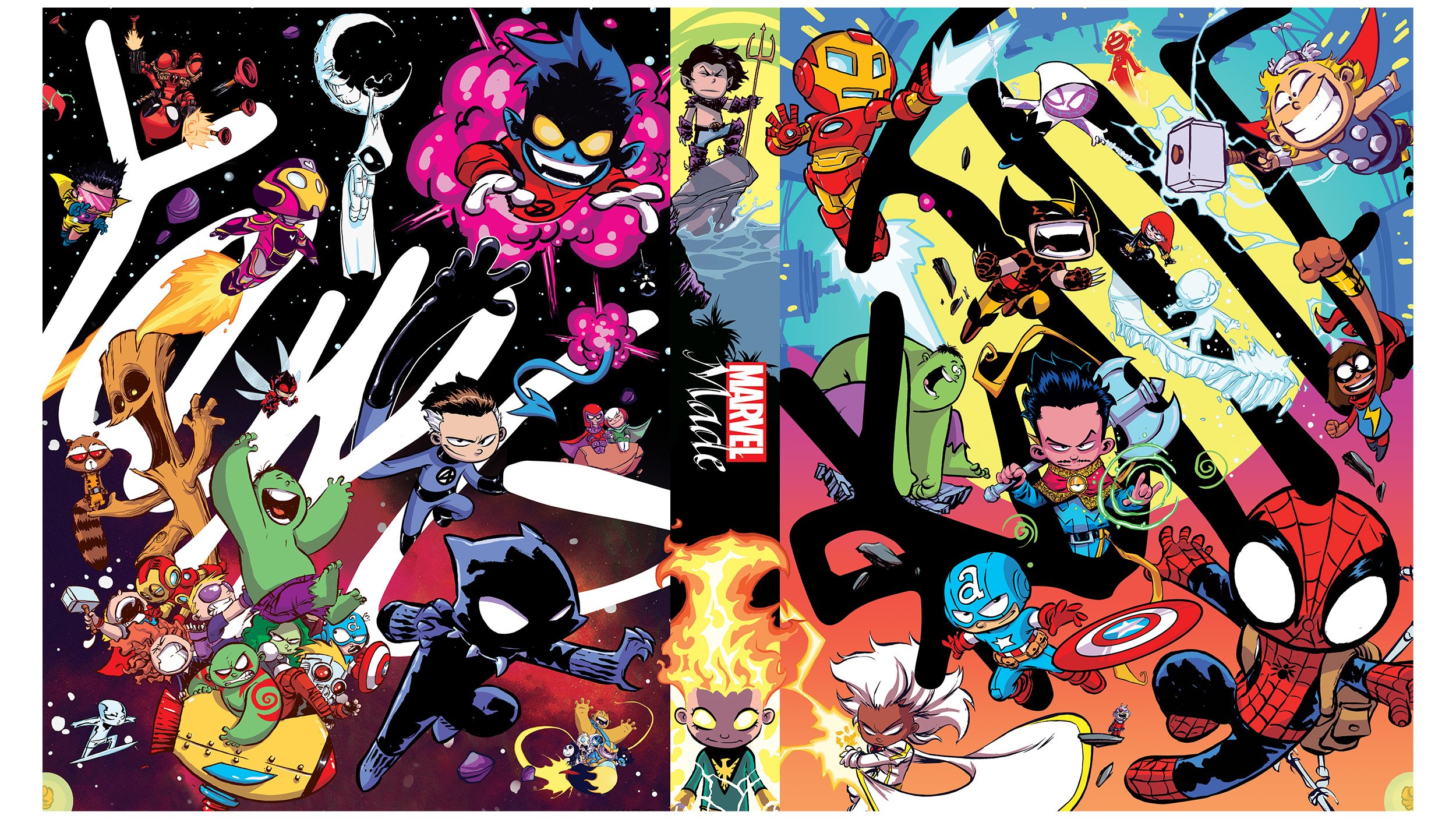
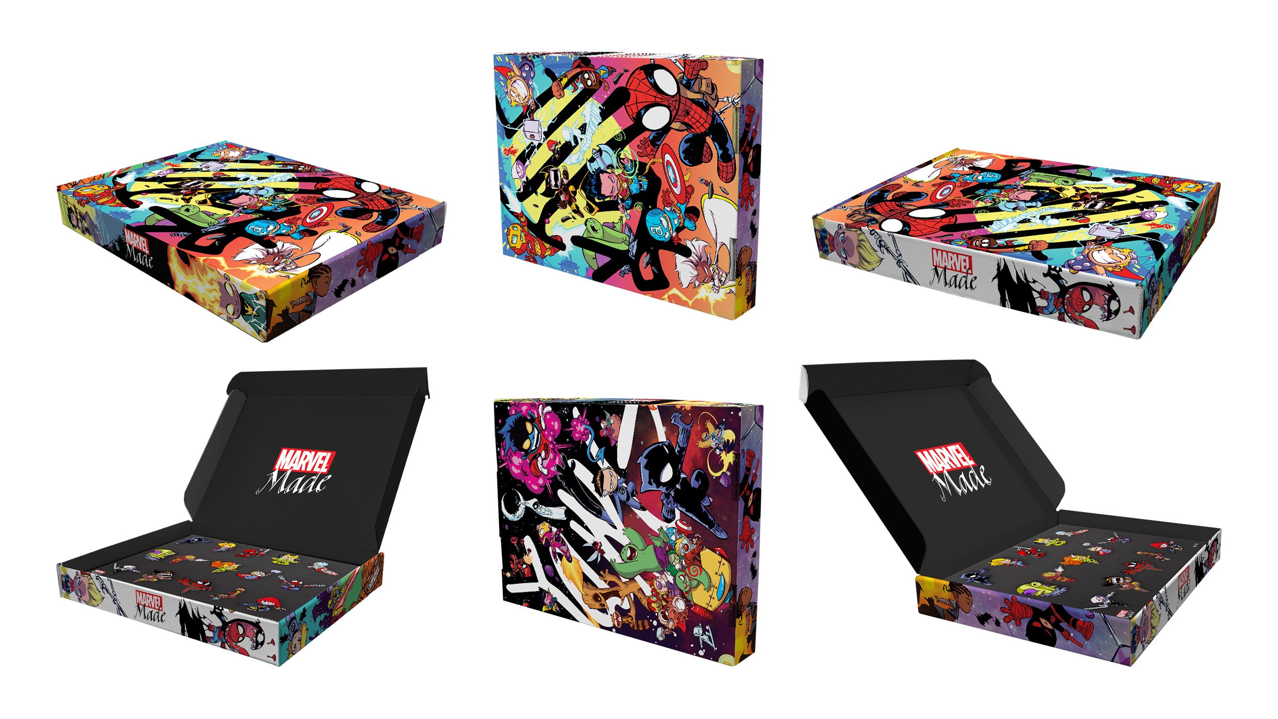
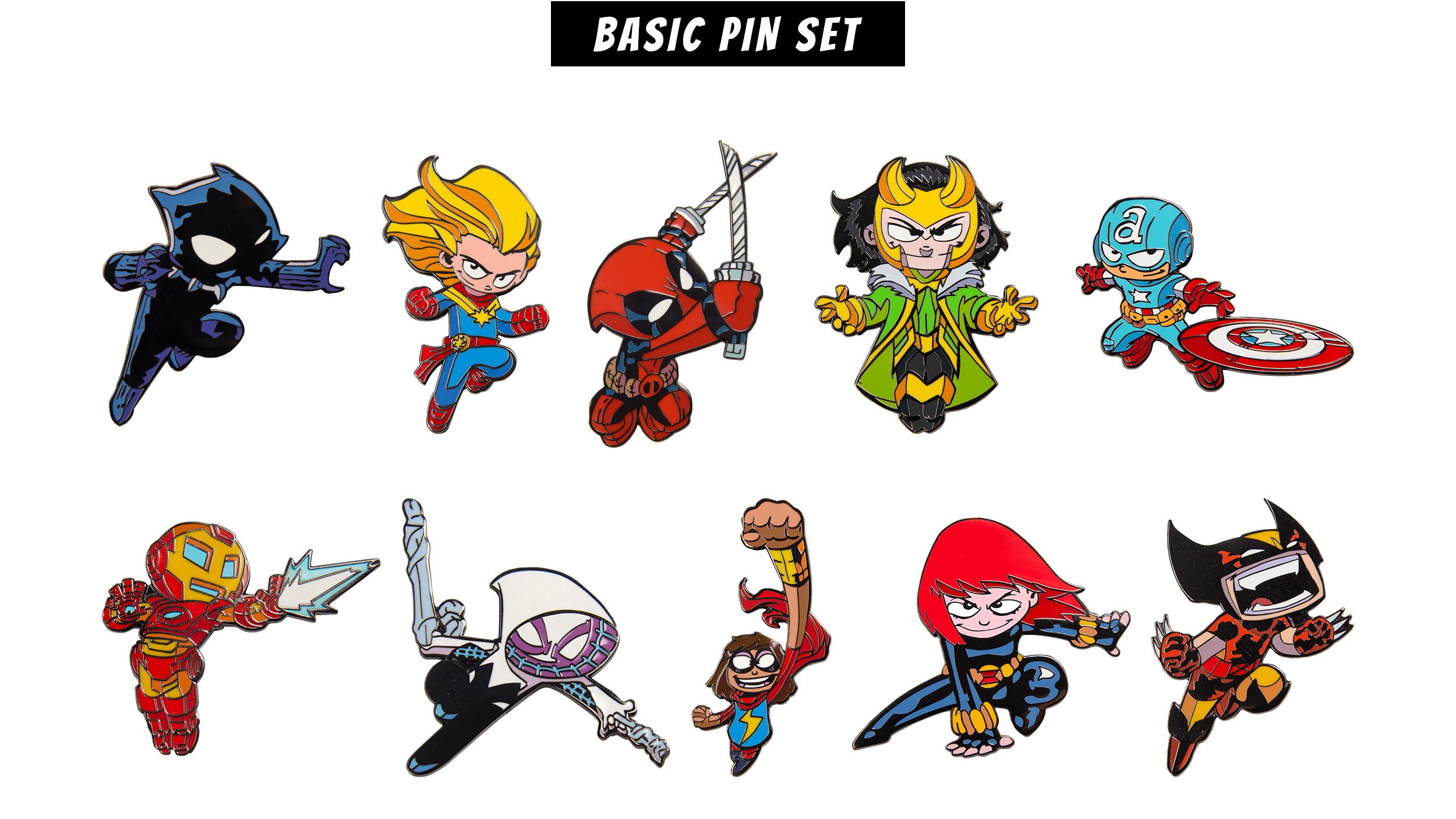
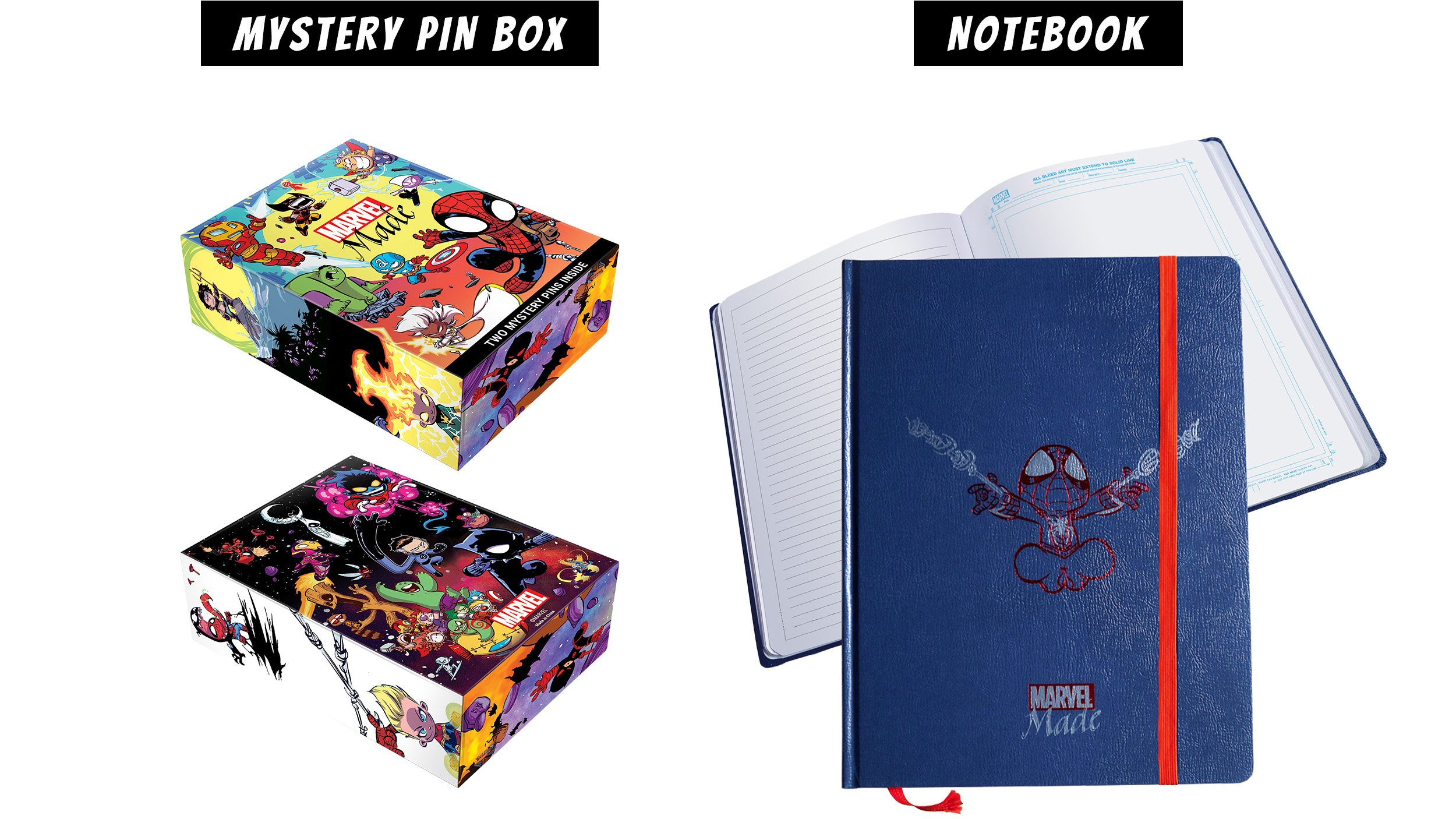
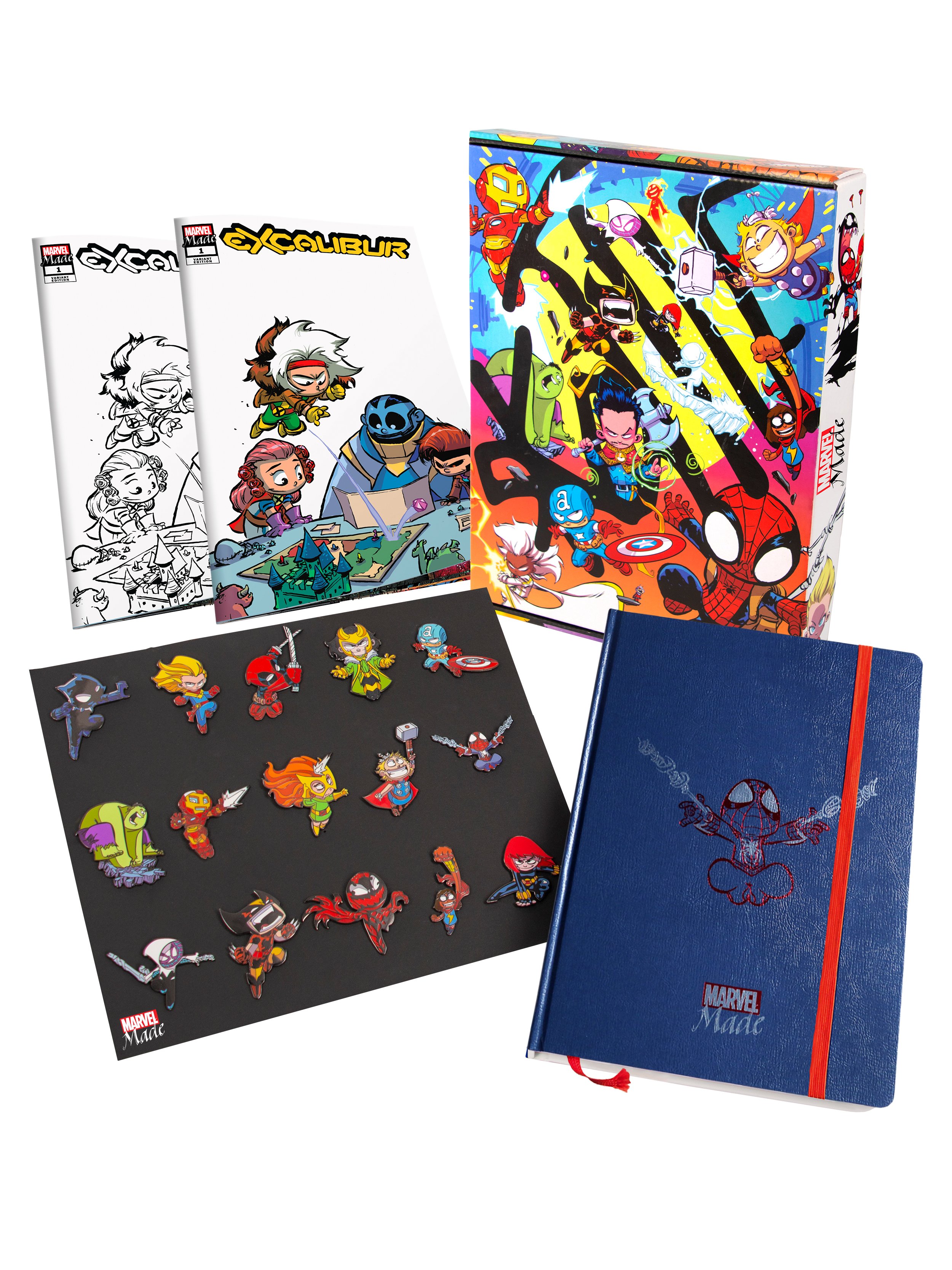
Marvel Made is a merchandise publishing brand created by Marvel that sold exclusive, limited availability, high-end merchandise based on Marvel properties. The first of its products was the "Marvel Made Skottie Young Premier Collectibles," with only 2,500 copies produced. Marvel character pins created by artist Skottie Young, 5 bundle-exclusive pins, a hardcover notebook with extra pages of facsimile art board sketching pages, and a variant cover version of Excalibur (Vol. 4) #1 with cover drawn by Skottie Young.
Design Process!
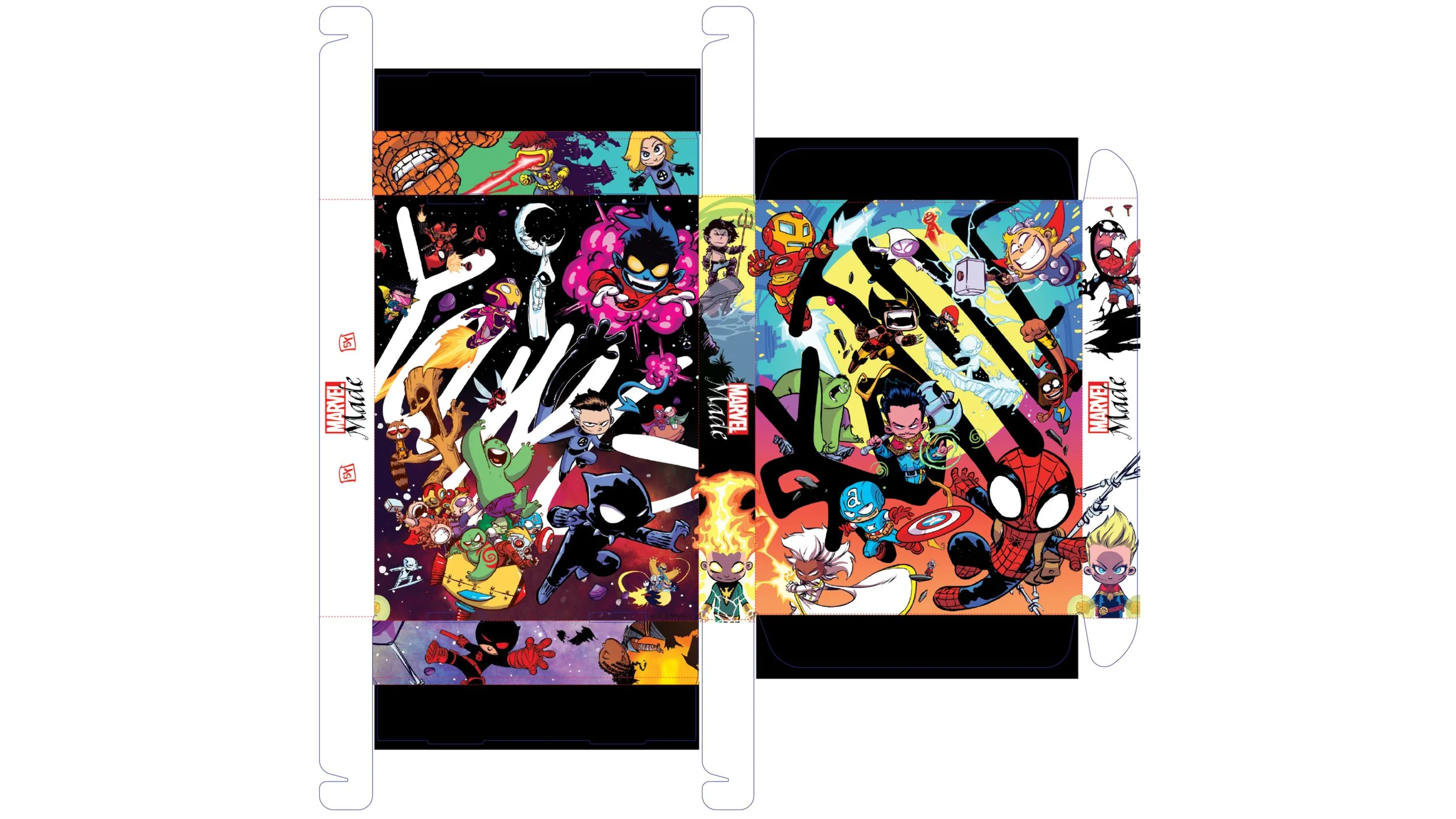
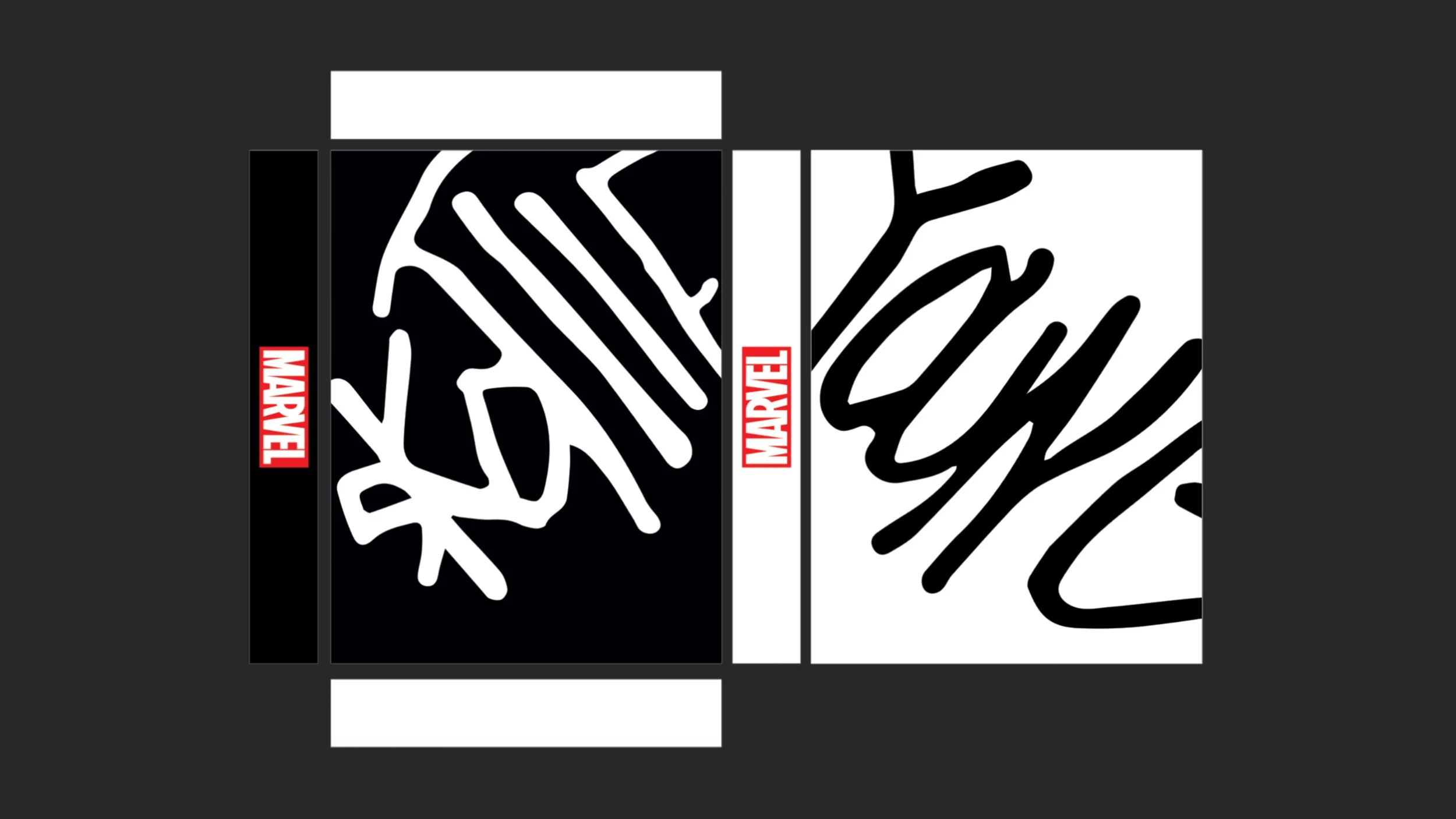
For this project, I had this immediate inner tug to bring my New York City roots to the design (graffiti walls were a huge inspiration!). I used Skottie Young’s signature as the centerpiece of the canvas and interwove his characters throughout so that this package could be a centerpiece for any Skottie & Marvel fan.






J.A.R.V.I.S.
Custom Sponsored Comic Website
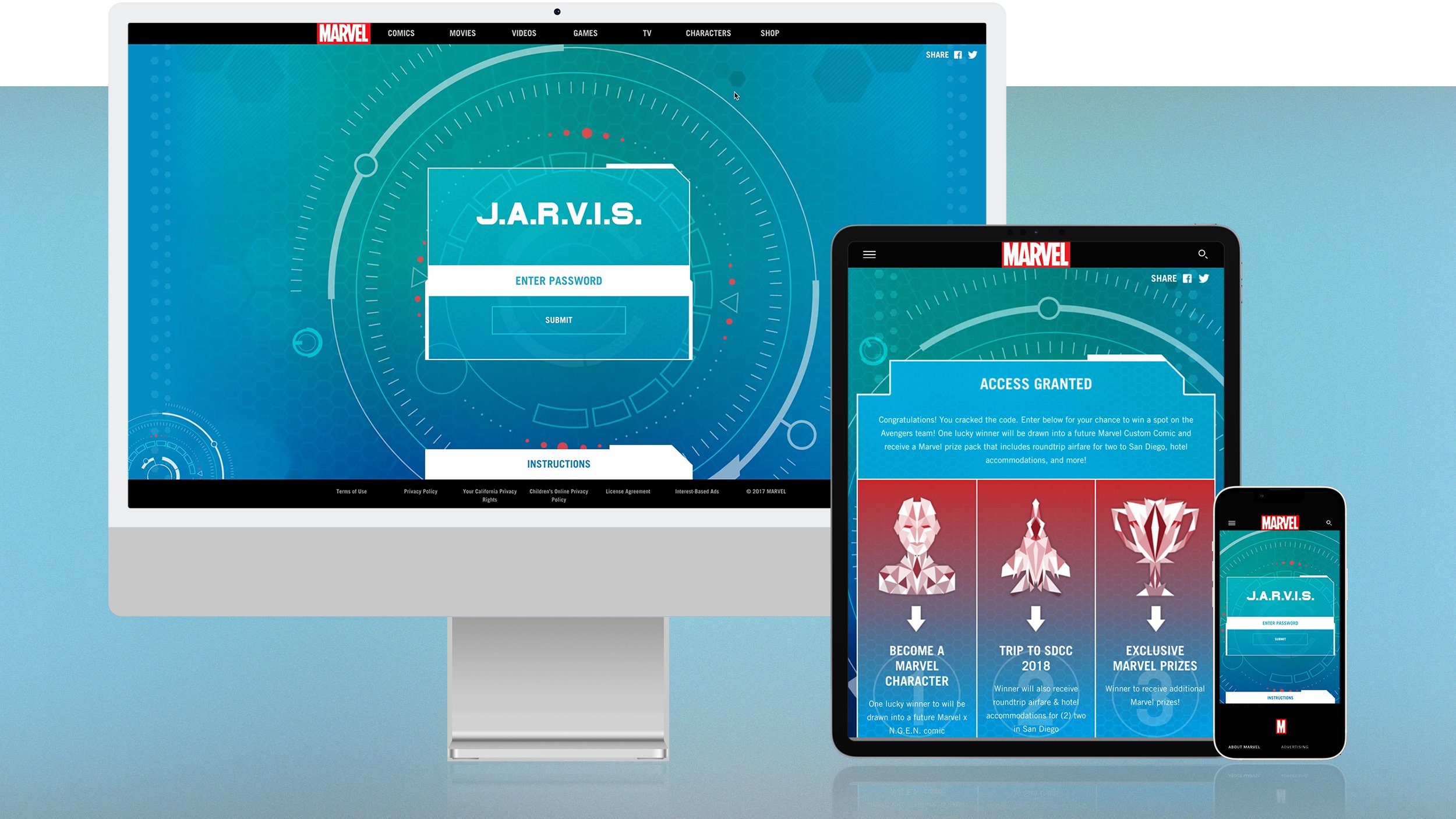
Avengers J.A.R.V.I.S. was an extremely fun project where, after reading an Avengers custom comic, readers would be sent to a mini-website that felt like they were operating the J.A.R.V.I.S. system from within and in the first person. To get beyond the home-screen, the user would have to find a password that was hidden within the comic. Those who found the password were able to have access granted, and enter for a chance to win some gnarly prizes.


Marvel Unlimited - App Relaunch
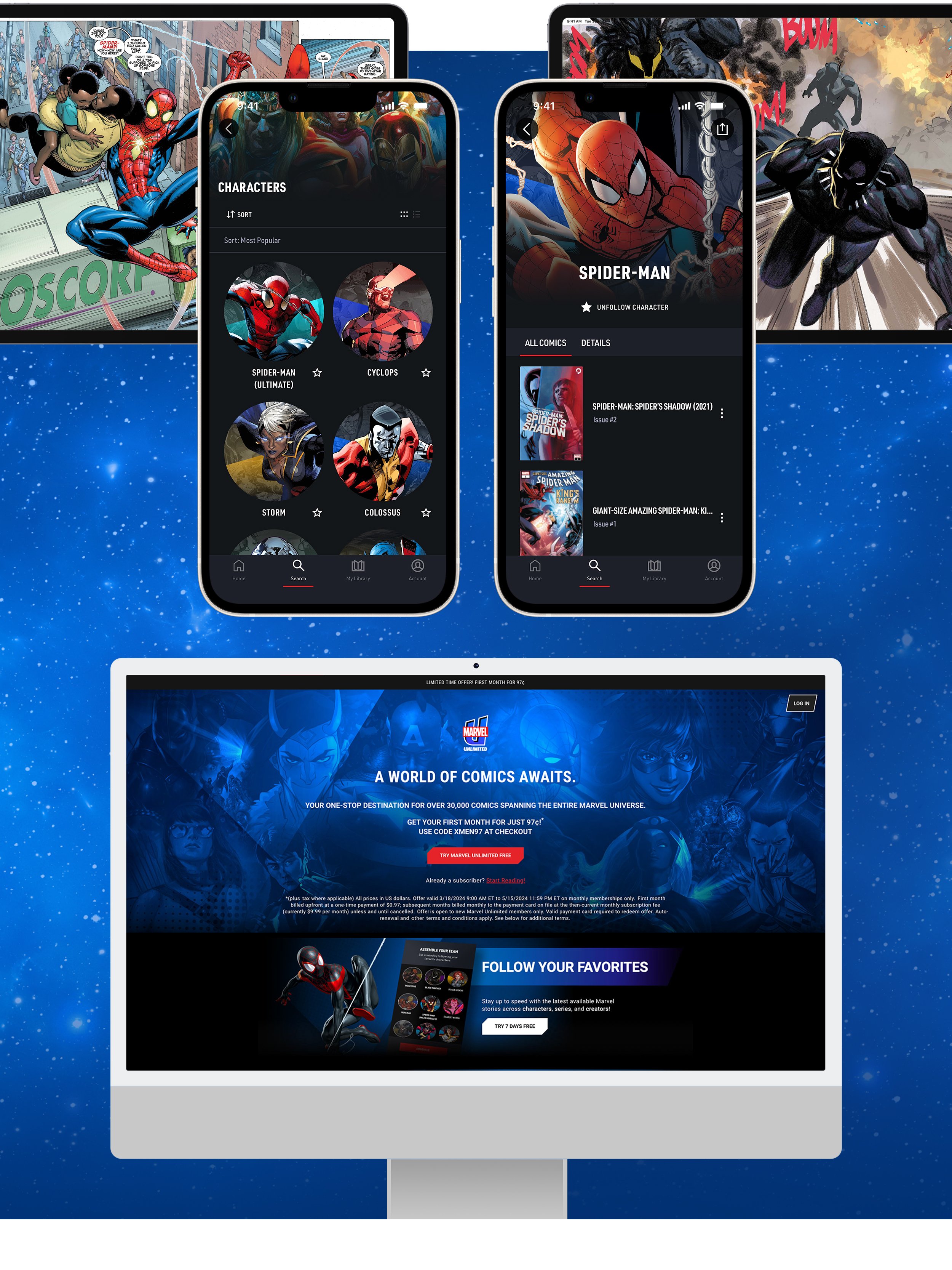
Marvel Unlimited is a member subscription service that gives members unlimited access to over 30,000 issues of Marvel's classic and newer titles.
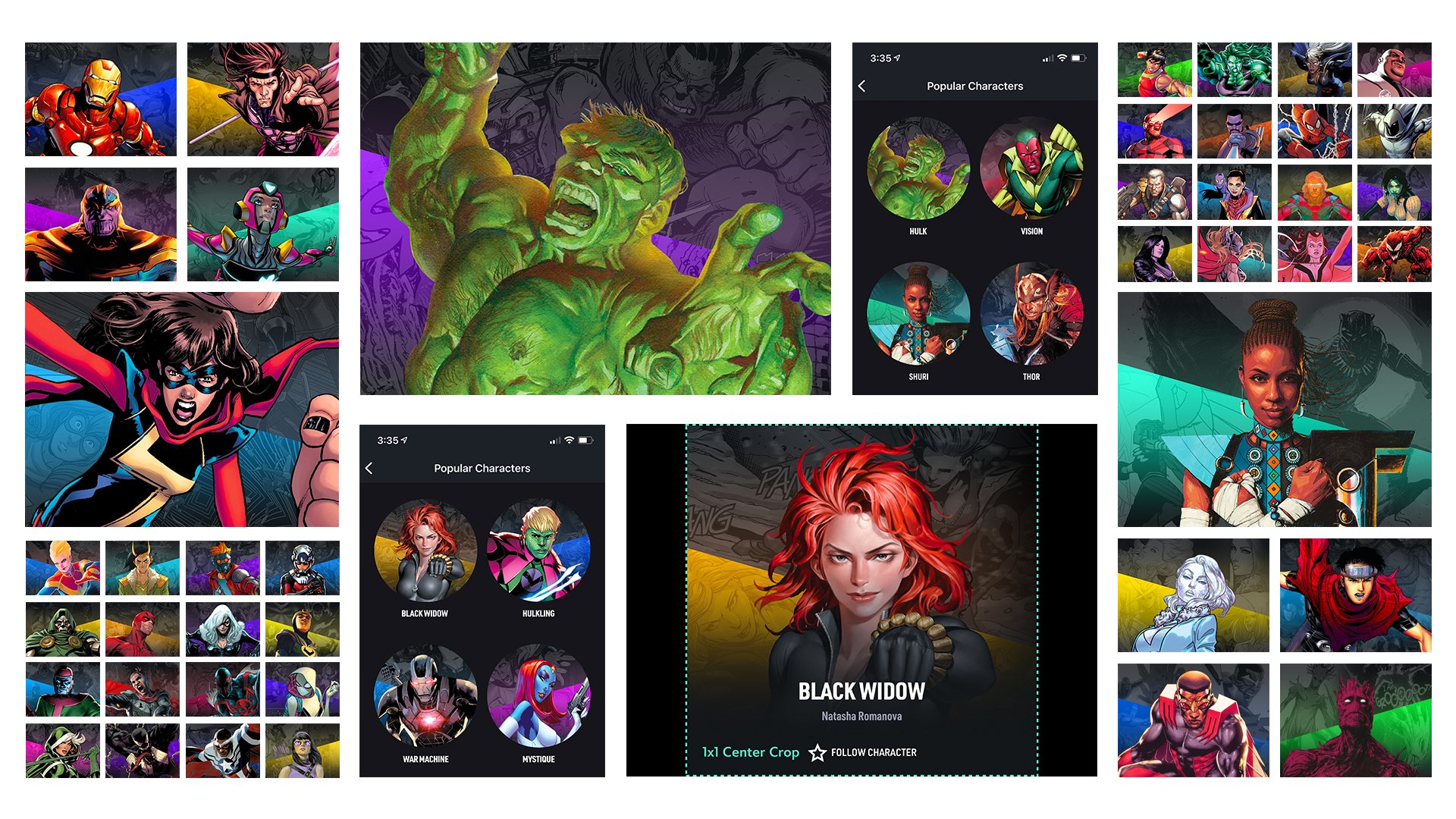
Character Entity Images
Marvel has over 8,000 characters in its library. THANKS BE TO THOR that we came to the conclusion that we only needed a fraction of these characters to have custom thumbnails. I was placed as lead over this project and oversaw the template and final production of over 800 characters (I think Thor would still be impressed).

Marvel Unlimited Plus Kit - Venom
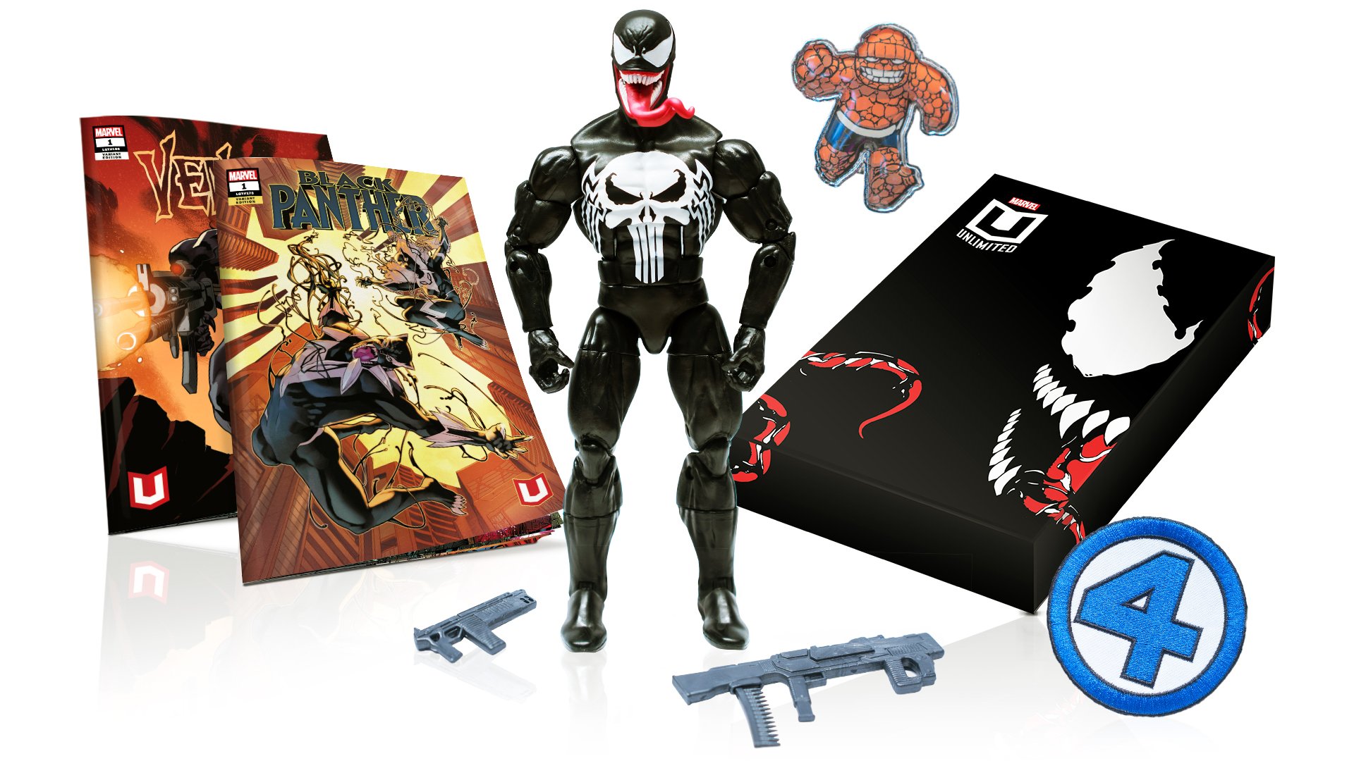
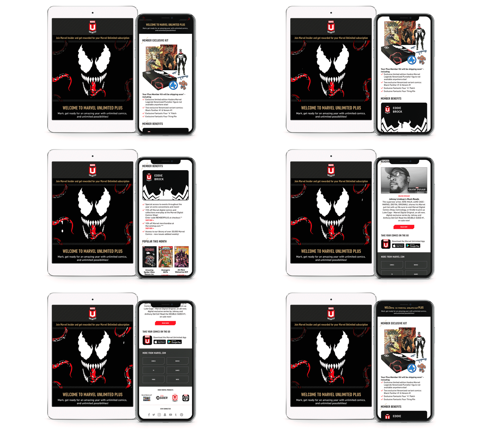
Marvel Unlimited Plus is a Marvel membership where fans can both read their favorite comics digitally, as well as receive a once-a-year membership kit. As the designer of this year’s kit, I was privileged to create a design featuring the lethal protector himself, Venom! My goal was to tell a story of transformation with all the various assets including the MU box itself, Welcome Letter, Membership Card, & even bringing Venom to life through an animated Welcome e-mail.



Marvel Unlimited Plus Kit -
X-Men & Iron Man
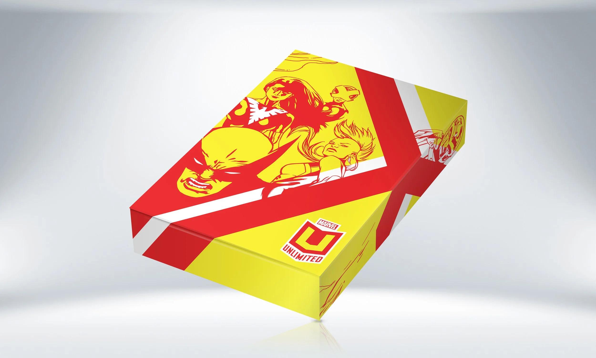
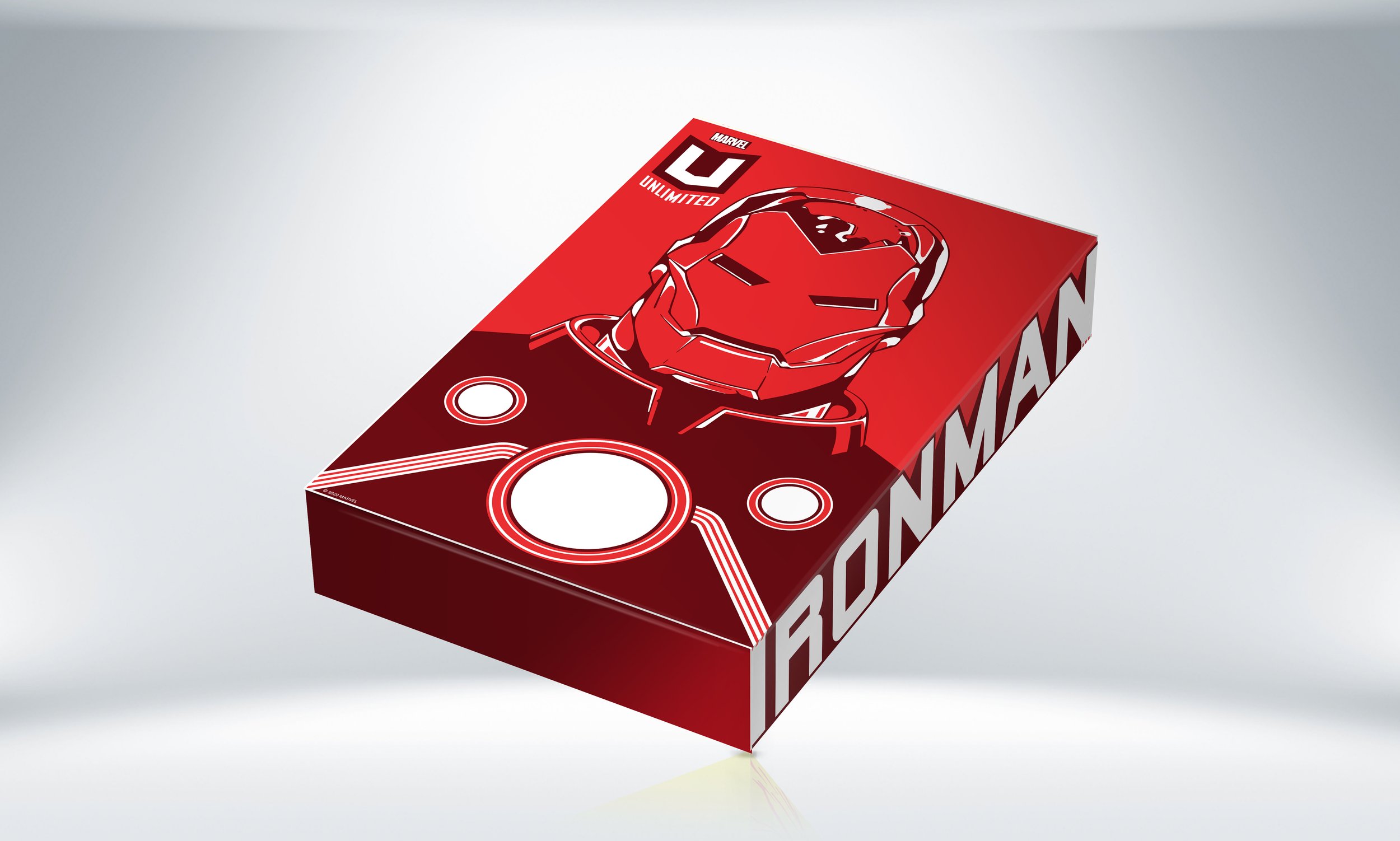
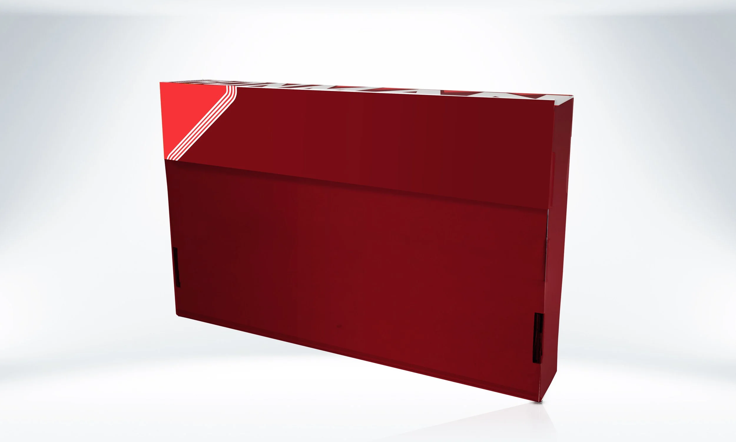
With these membership kits being sent out every year, I was given the pleasure of leading the art direction and designing both a X-Men and Iron Man inspired package design. With package design, I’m very passionate about telling a story with every corner of the piece, as seen with the “X” reveal upon opening the box for X-Men and connecting the image of Iron Man via accent lines to the related logo.







Marvel Insider - Logo Refresh
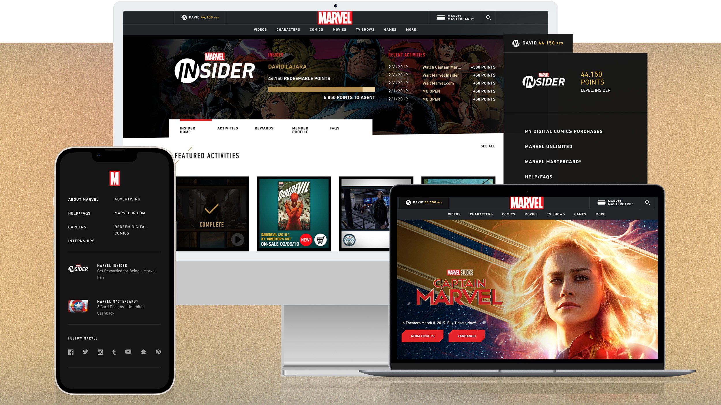
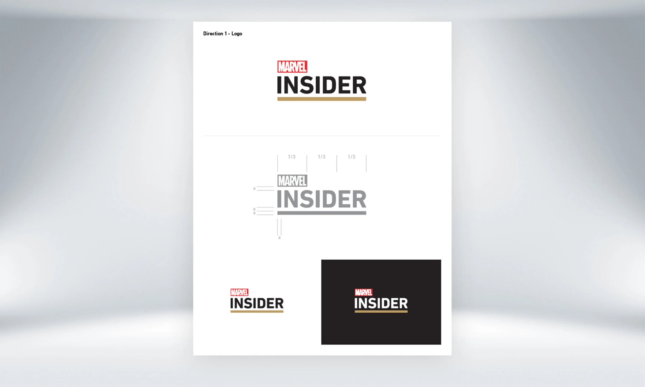
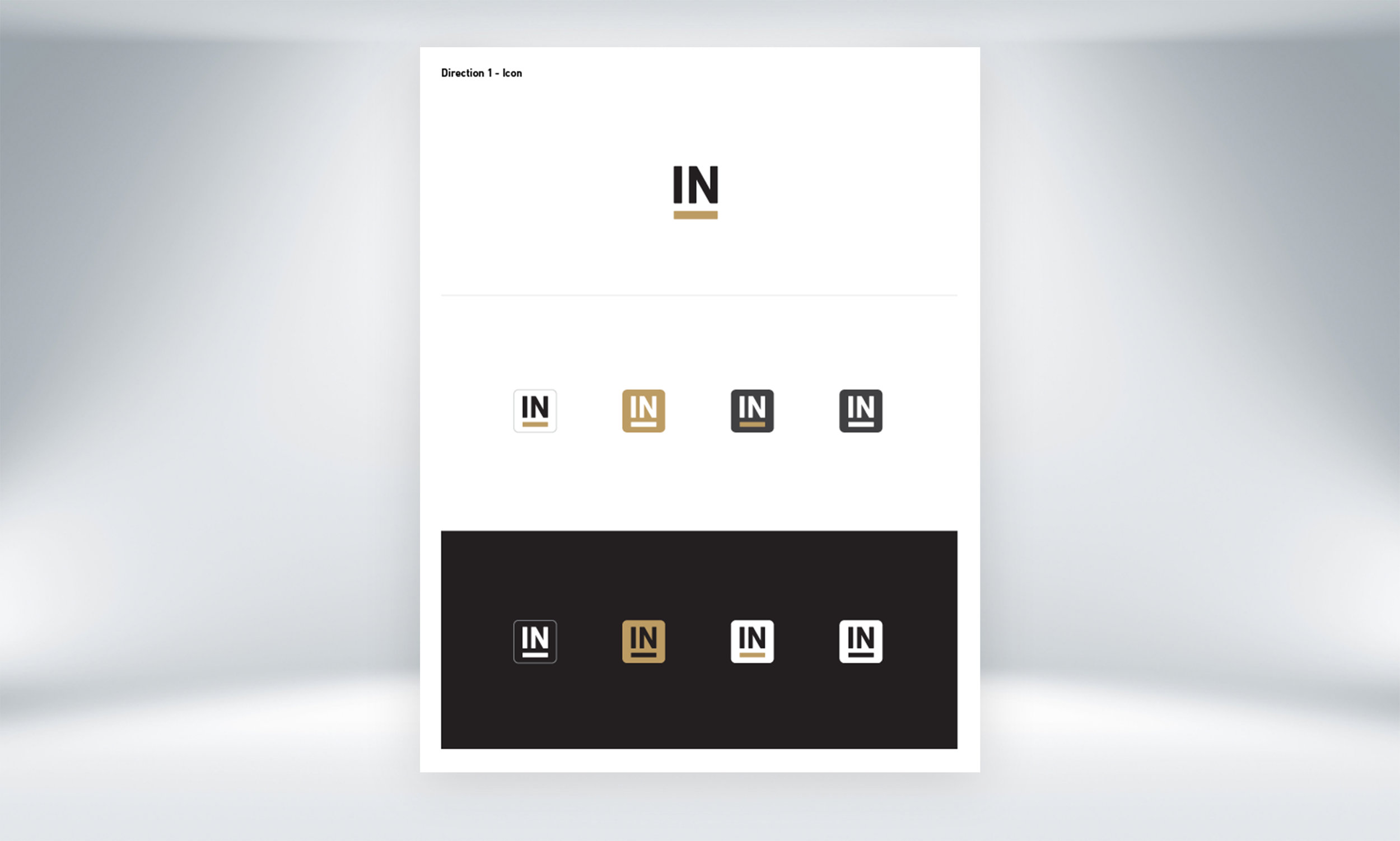
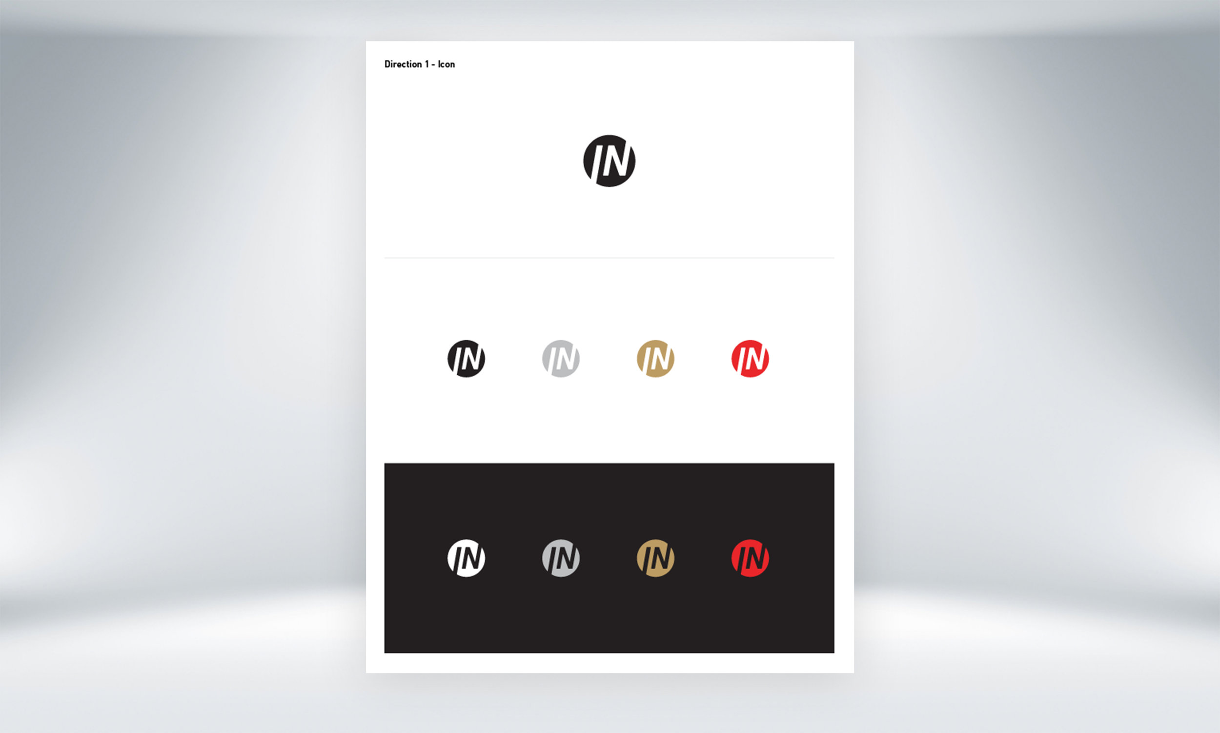
The Insider team requested an “icon” for the Insider program to be used across our digital platform that would allow more subtle but intentional integration into other Marvel content. The main goals were to: create an icon that has the "feel" of the original Insider logo; have the ability to have a light and dark variation, and be able to exist in the Marvel brand ecosystem.






Marvel HQ - ‘Avengers Match’ Game Design
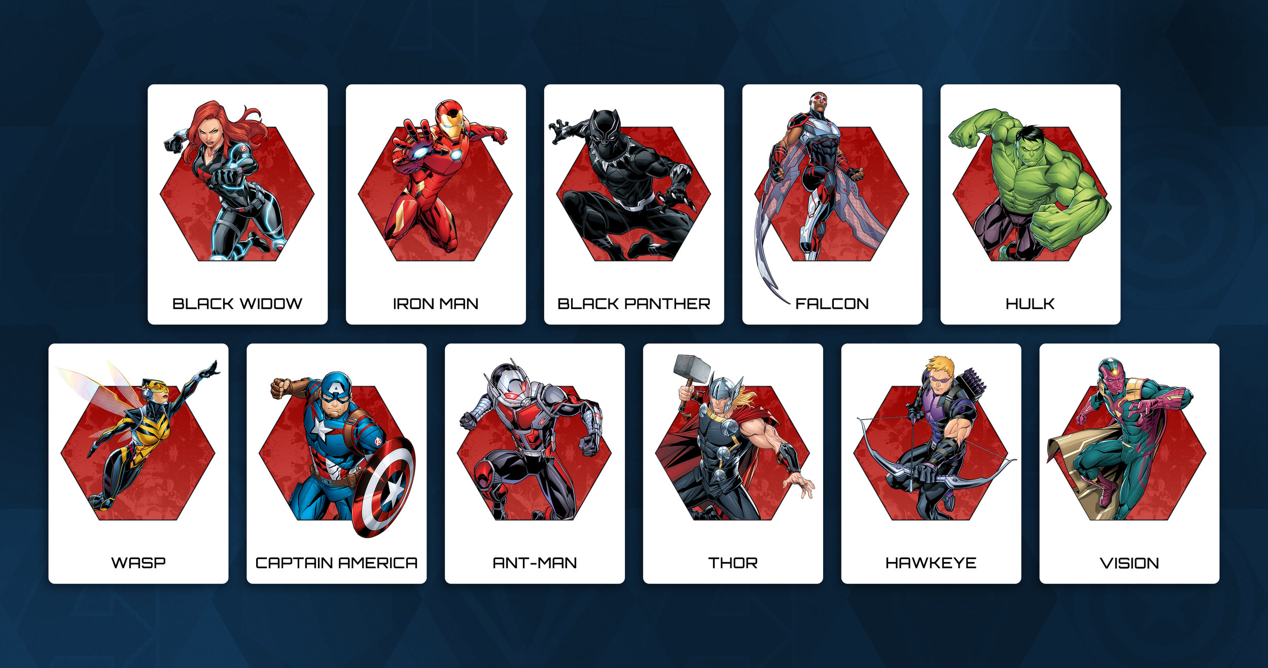
Marvel HQ is the kid-friendly website and app hub for Marvel. Here, kids can play games, watch show clips and find out more about their favorite Marvel hero. During my time at Marvel, I led the design direction for Marvel HQ and created the look and feel for many of our templated games. One of these games was “Avengers Match” where kids put their memory to the test and tried to match Marvel’s finest heroes!

More Featured Work

ESPN
Tournament Challenge, NBA Draft + selected work

Disney
Disney Homepage, DisneyNOW + selected work
Meeq: Inherit Rebirth
Brand identity, art direction + visual storytelling